
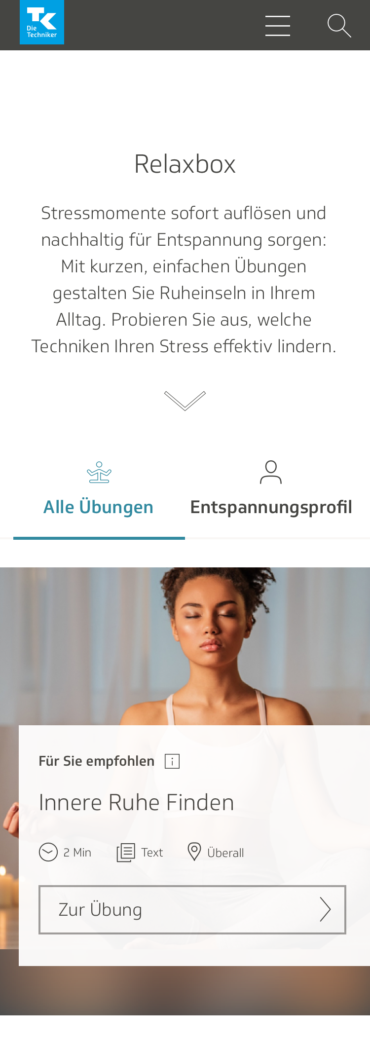
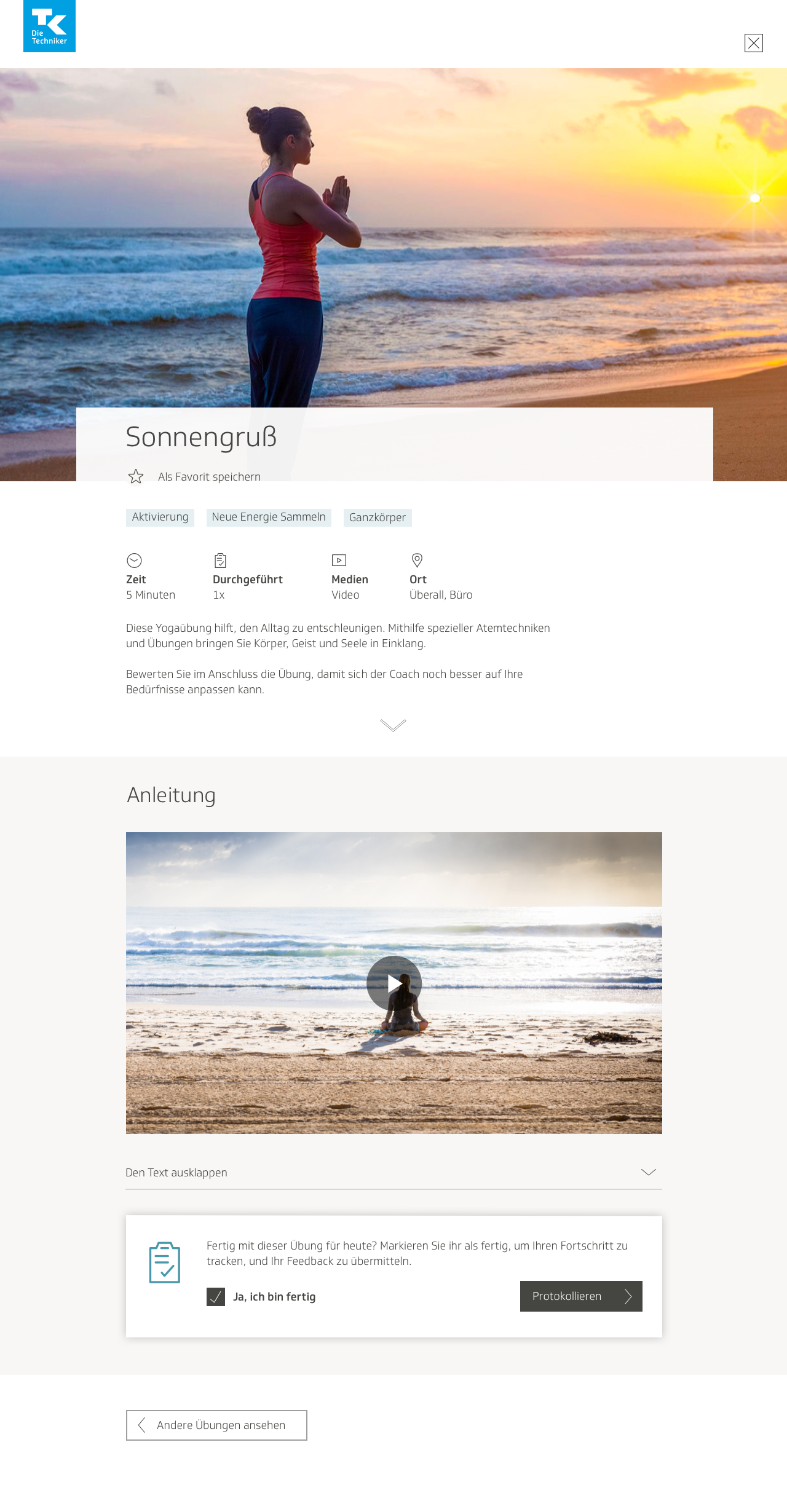
Relaxbox
Relaxbox is a collection of interventions for decreasing acute stress attacks. It is meant to serve as a complement to a rigorous program aimed at tackling stress using long-term solutions.
Categories
UI/UX design, healthcare, anti-stress, web app
Contents
- A brief introduction to Relaxbox and the TK eCoach
- Entry points
- Individual exercise page: early drafts
- Initial user flows
- First round of visual designs and user testing
- Implementing user testing feedback
- User profile
- Visual design for overview page
- Visual design for exercise page
- Refining the user profile
- Conclusion
A brief introduction to Relaxbox and the TK eCoach
Relaxbox is part of a greater eCoach app that exists on the website of the Techniker Krankenkasse, also known as TK. As Germany’s biggest socialized health insurance provider, the TK boasts 11 million members. The eCoach was started as a rigorous program to help TK members improve their physical and mental health in five categories: weight loss, anti-stress, nutrition, fitness, and quitting smoking.
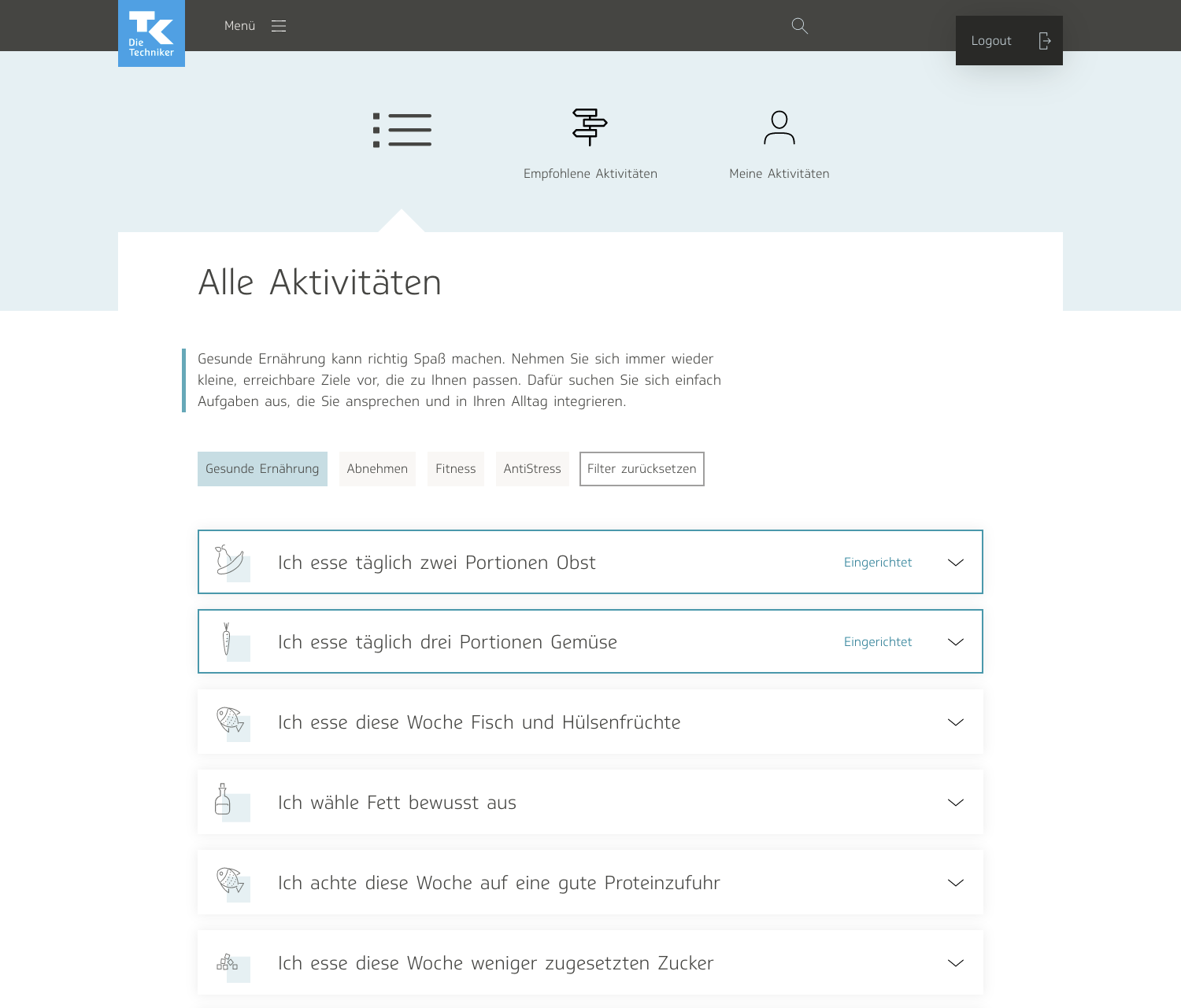
The user selects one of the five health goals and delves into more specifics about what they want—what their personal goals are, how long it will take to achieve said goals, and so on. Once that is set up, the user selects from a list of activities that they want to include in their program. It can be routines such as “eat a portion of fruit twice a day” or “do yoga for 30 minutes a day.”
The user then plans which days of the week they want to implement this protocol. They also have the chance to read a little bit more about what the activity entails.
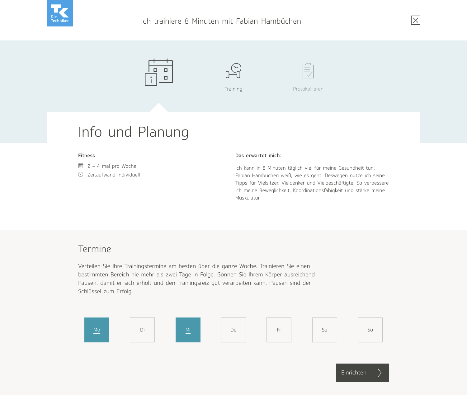
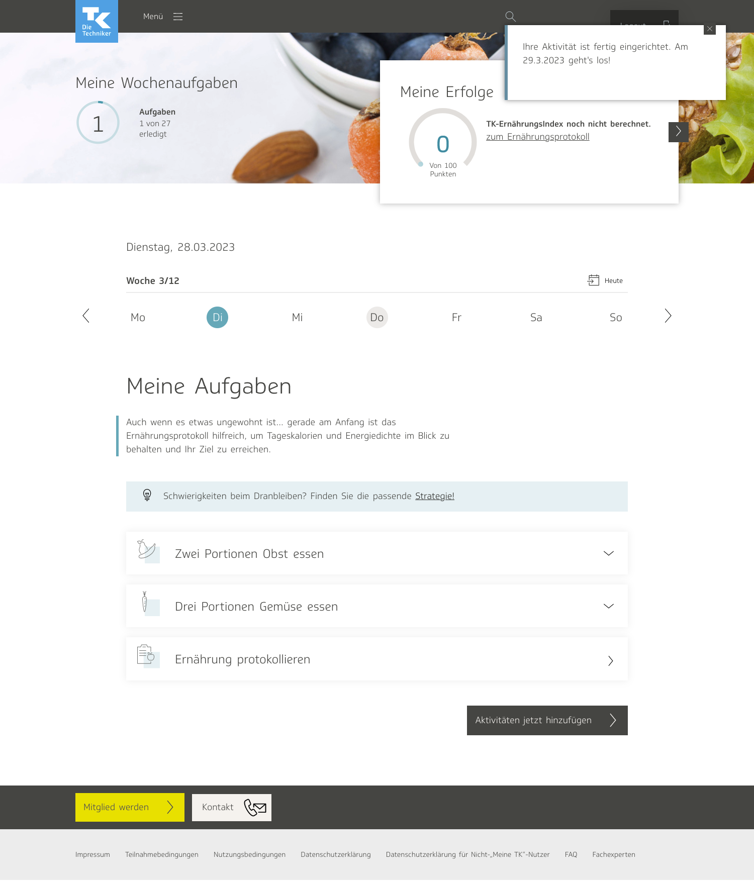
The user is then redirected to a personalized page for the activities they have selected, called “My Tasks.” There, they can see what tasks they have planned out for that day, and check them off as “done.”
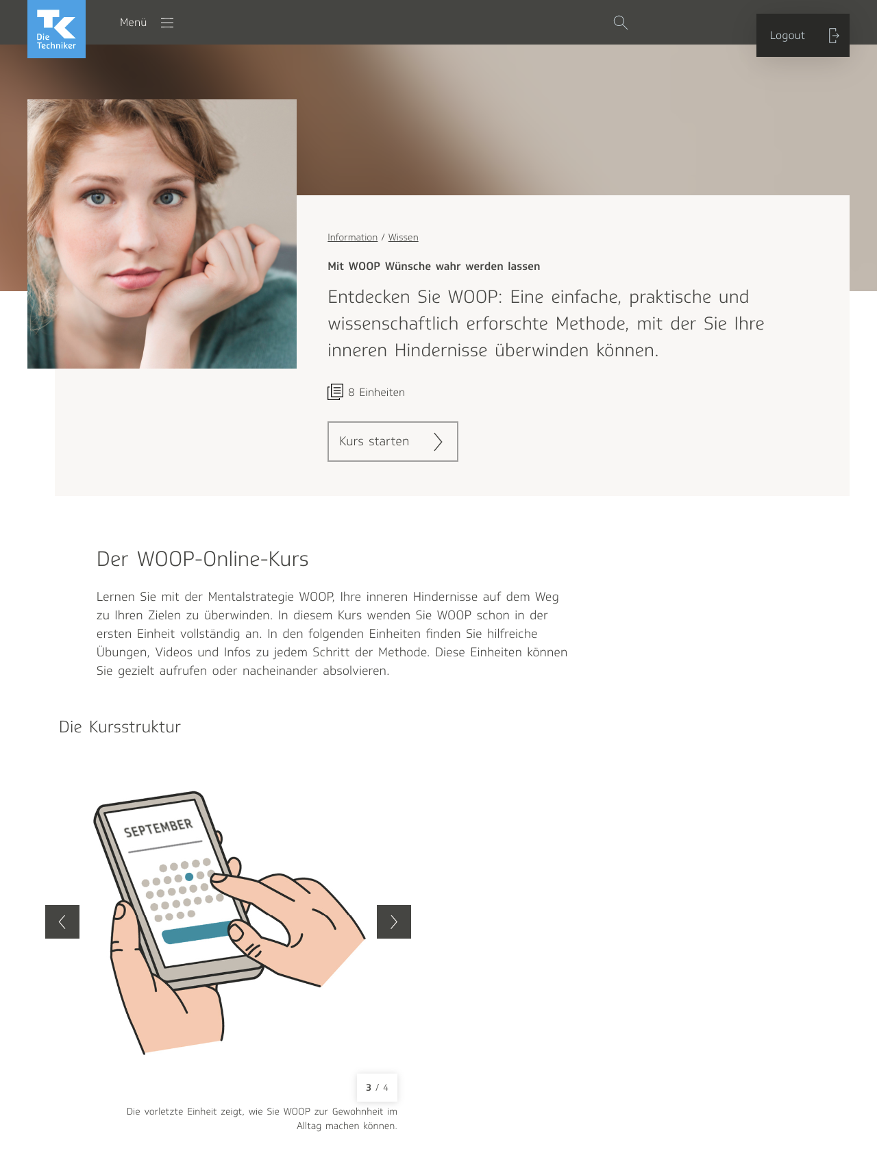
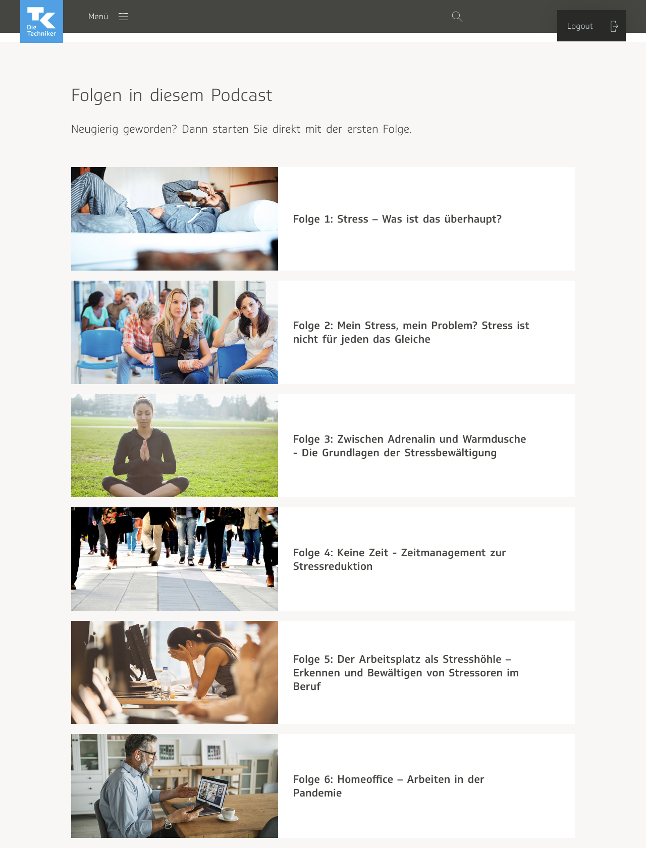
Many other resources can be found on the site, such as articles, courses, and podcasts. (I assisted on the two designs below— to view my illustrations for the TK WOOP course!)
Relaxbox, which went live in the fall of 2021, is one of those additional resources. It is a toolkit of small exercises meant to be practiced when a user is suffering acute stress. It is meant to serve as a complement to the anti-stress eCoach. What differentiates Relaxbox from the anti-stress program is that whereas the former is designed to handle intense bouts of stress in the short-term, the latter is a more rigorous regimen meant to help users decrease their stress significantly in the long run. Relaxbox was also conceptualized with the intention of hopefully coaxing users over to setting long-term goals in the anti-stress coach. Throughout the course of the project, my team was a product owner, two people in charge of content, and an additional designer just for the first phase of the project, to onboard me.
Entry points
Relaxbox is the first project I worked on for TK. The eCoach is a massive, complex tool; even after years of consistent usage, most people don’t know it inside out. Thus, there was a lot of onboarding involved. In order to give me time to get to know the eCoach better, my team gave me a simple task to start: decide on the entry points for Relaxbox—where in the site would the user be able to navigate their way to it?
I went through the entire website, making a list of potential entry points. In the end, three made the most sense to me. The first one was in the navigation menu, under “Information,” with the knowledge section, which was a collection of articles, and the cookbook. Relaxbox was also its own entity, a resource of information, independent of the main eCoach program, so I thought it made more sense to place it there than under “My Coaching.”
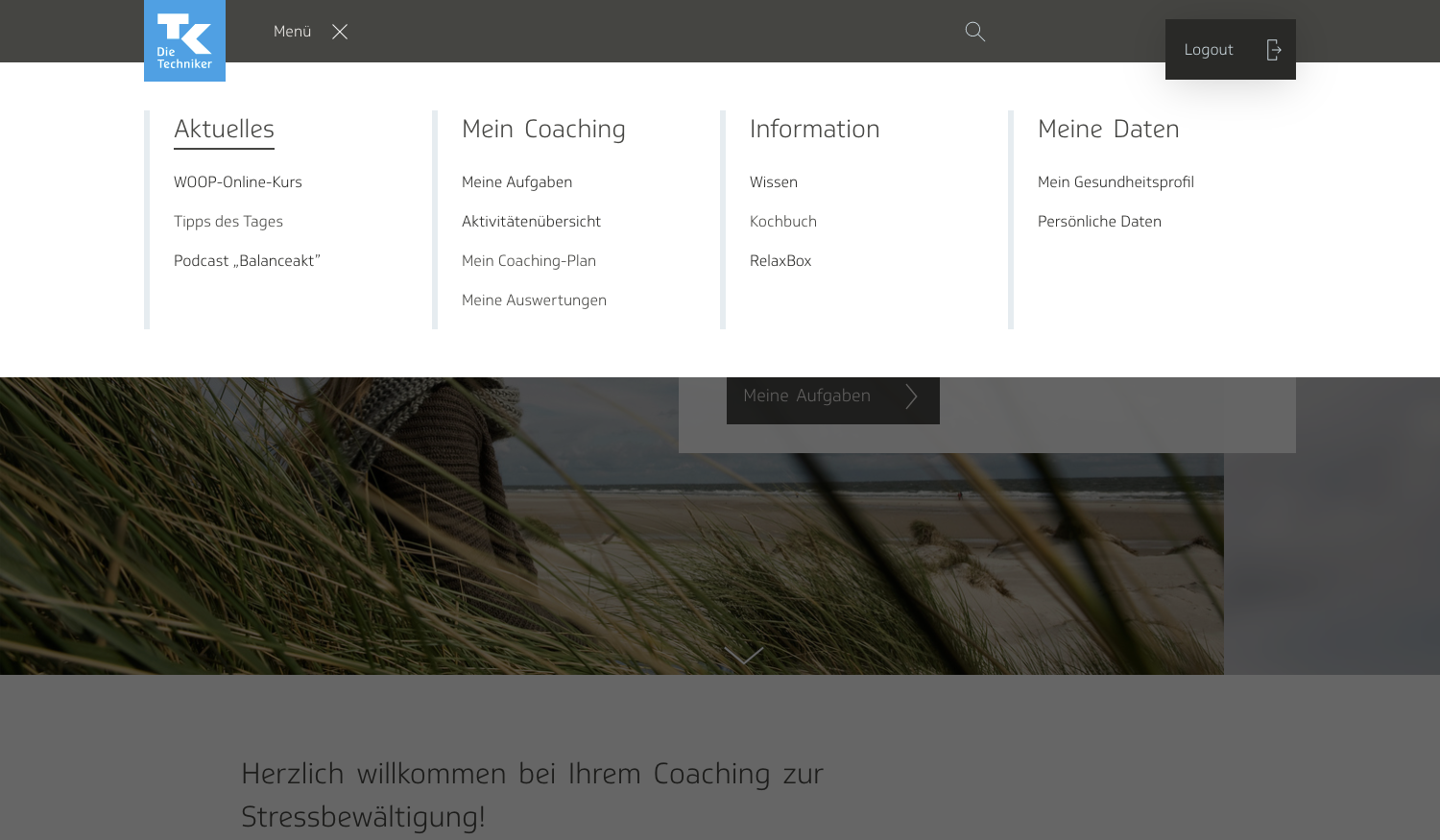
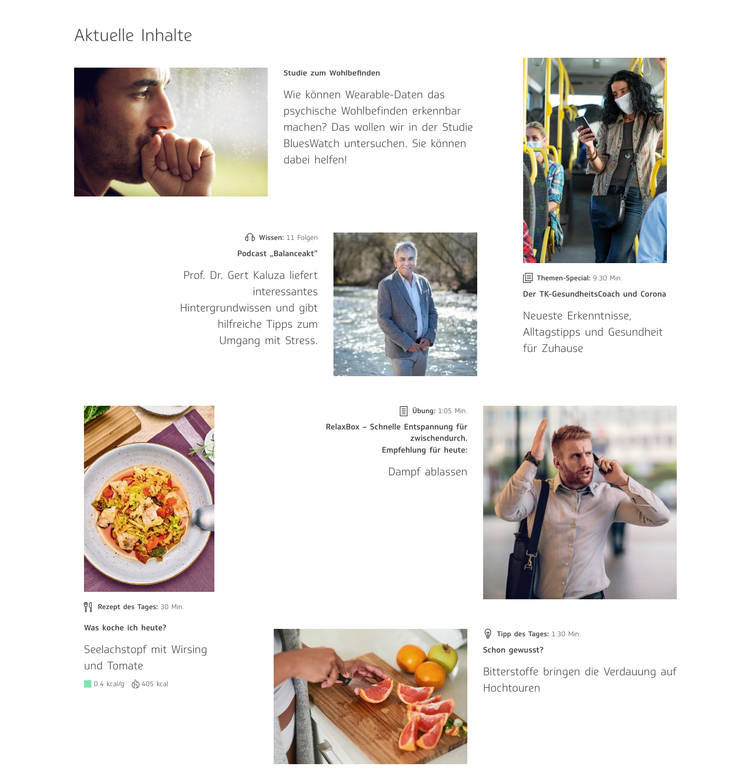
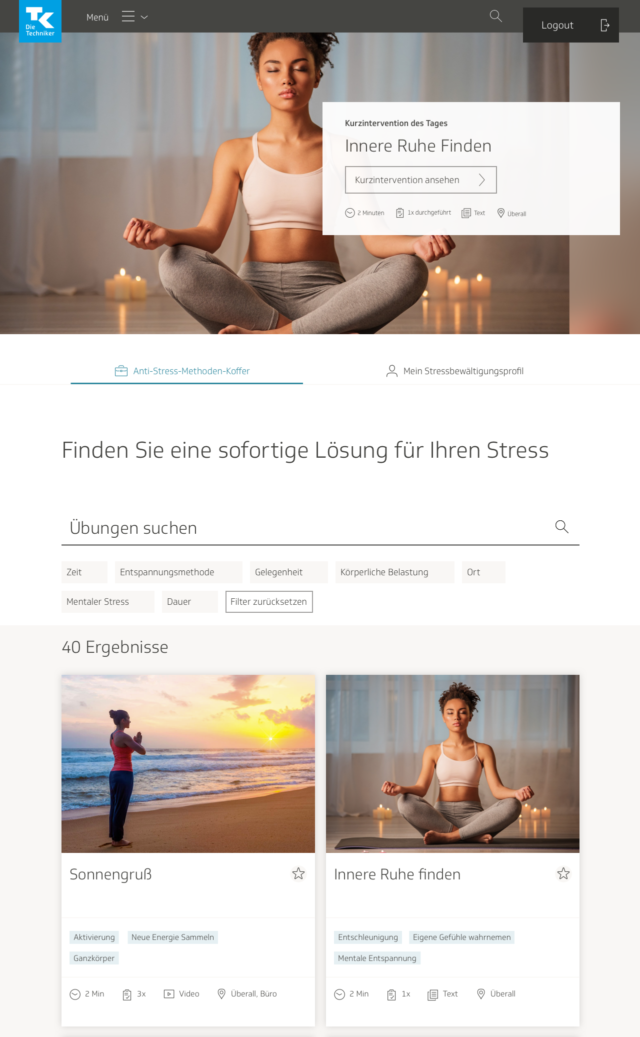
On the start page for the eCoach, there is a set of three tiles, just underneath the welcome screen on the top, showcasing content that might be of particular interest to the user. I suggested including it there as well, at least for the anti-stress coach. I didn’t think it would be as important for users who had selected other health goals to see it. Anti-Stress-Methoden-Koffer was our working title for most of the project until it went live; “Koffer” means suitcase in German.
Later, I even designed my own suitcase icon for it. The TK, however, said it had too strong a connotation of work and office environments, which are not exactly known for being stress-free. Later, they would change the name of the project to “Relaxbox.”
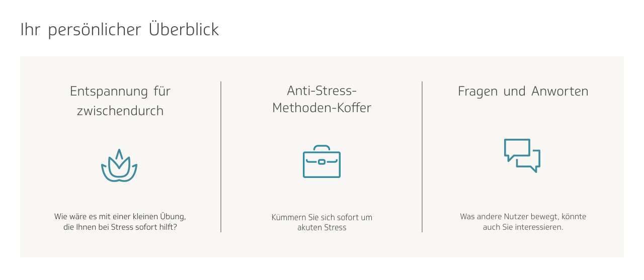
However, one issue I foresaw was the confusion with the tile to the left of it, which says “Relaxation for here and there.” It led to the list of anti-stress activities. I pointed out that we would need to either replace one of the tiles with some other content or make them more differentiable from each other.
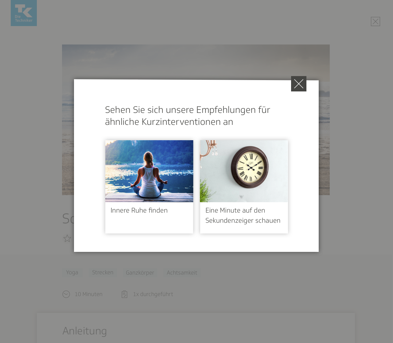
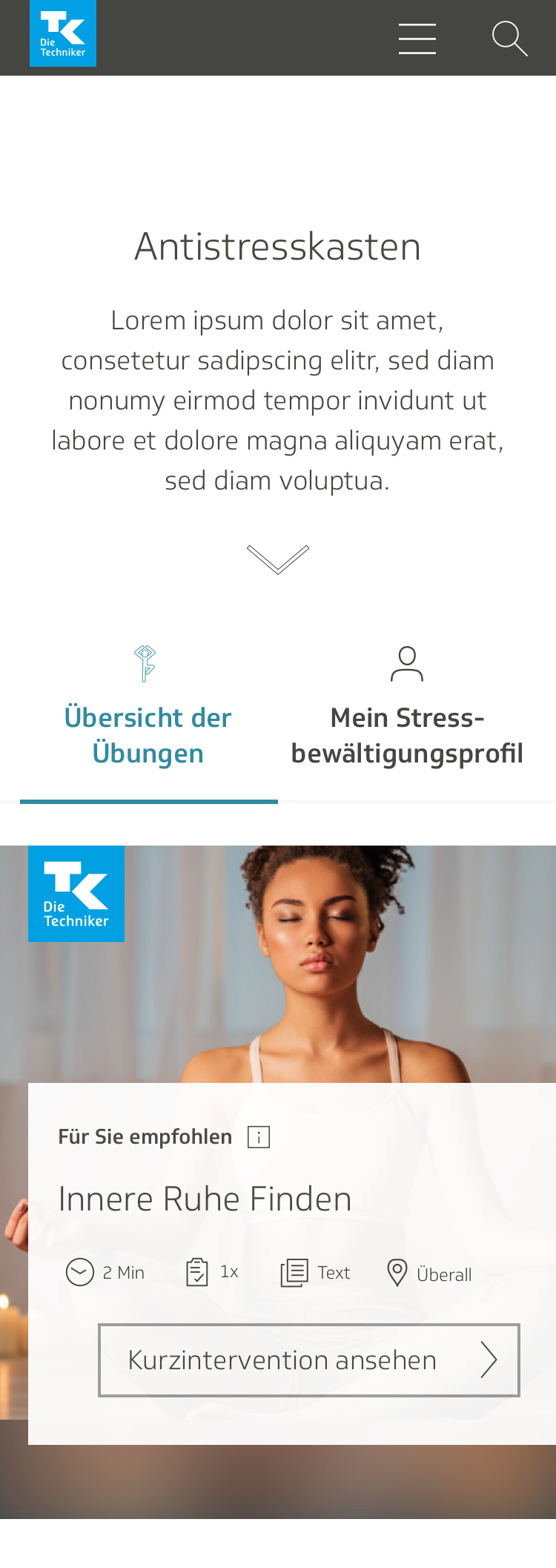
This is how it looks now, with Relaxbox sitting next to a tile indicating an anti-stress course, and a tile linking to an FAQs page. The Relaxbox tile also indicates what it is, with a message saying, “Quick help against stress.”
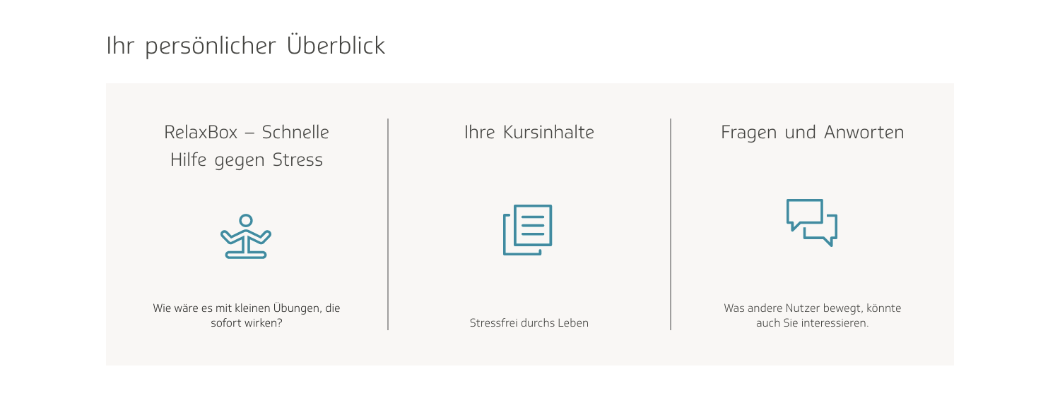
The third entry location that I envisioned was further down on the start page, where blurbs are listed of all the most up-to-date content on the site, such as podcasts, articles, and tips of the day. I thought it could make sense to have a thumbnail there leading to one of the Relaxbox relaxation techniques, which would change every couple weeks or so. The one shown here, “Dampf ablassen,” means to blow off steam.
All three of these locations were either on the start page or in the navigation menu. I chose these due to accessibility and relevance. I didn’t think including them on any of the other pages, such as “Meine Aufgaben”—my tasks—would make much sense.
Individual exercise page: early drafts
During the initial phases of development for Relaxbox, I received the impression that it was intended to be quite simple: a collection of exercises for combatting stress, and little more than that. We thought it would be best to base it on the design for another existing product in the eCoach, the cookbook:
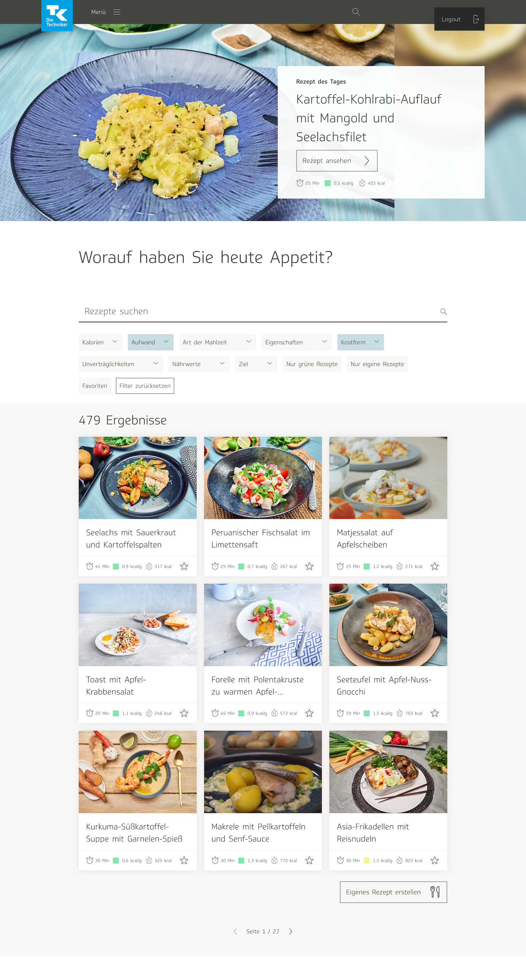
The cookbook also functioned as a database for a collection of how-to articles, so it made sense to us to have the Relaxbox follow a similar behavior, only with anti-stress interventions instead of recipes. Initially I did not see much need to tweak the design for the page showing all the recipes, only for the individual recipe page:
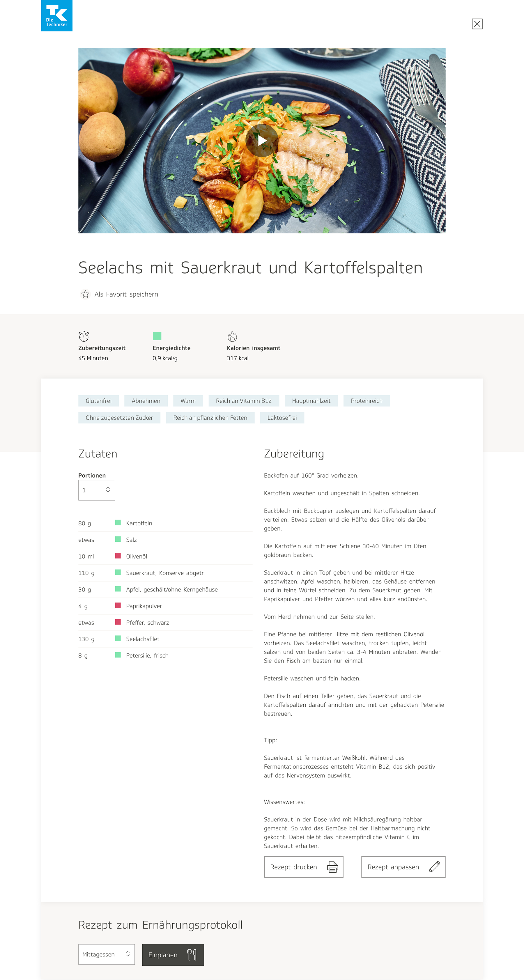
Since there were significant differences between the nature of the content for the recipe pages and the anti-stress interventions, I decided to tackle the design for the individual exercise page first, and generated a wireframe:
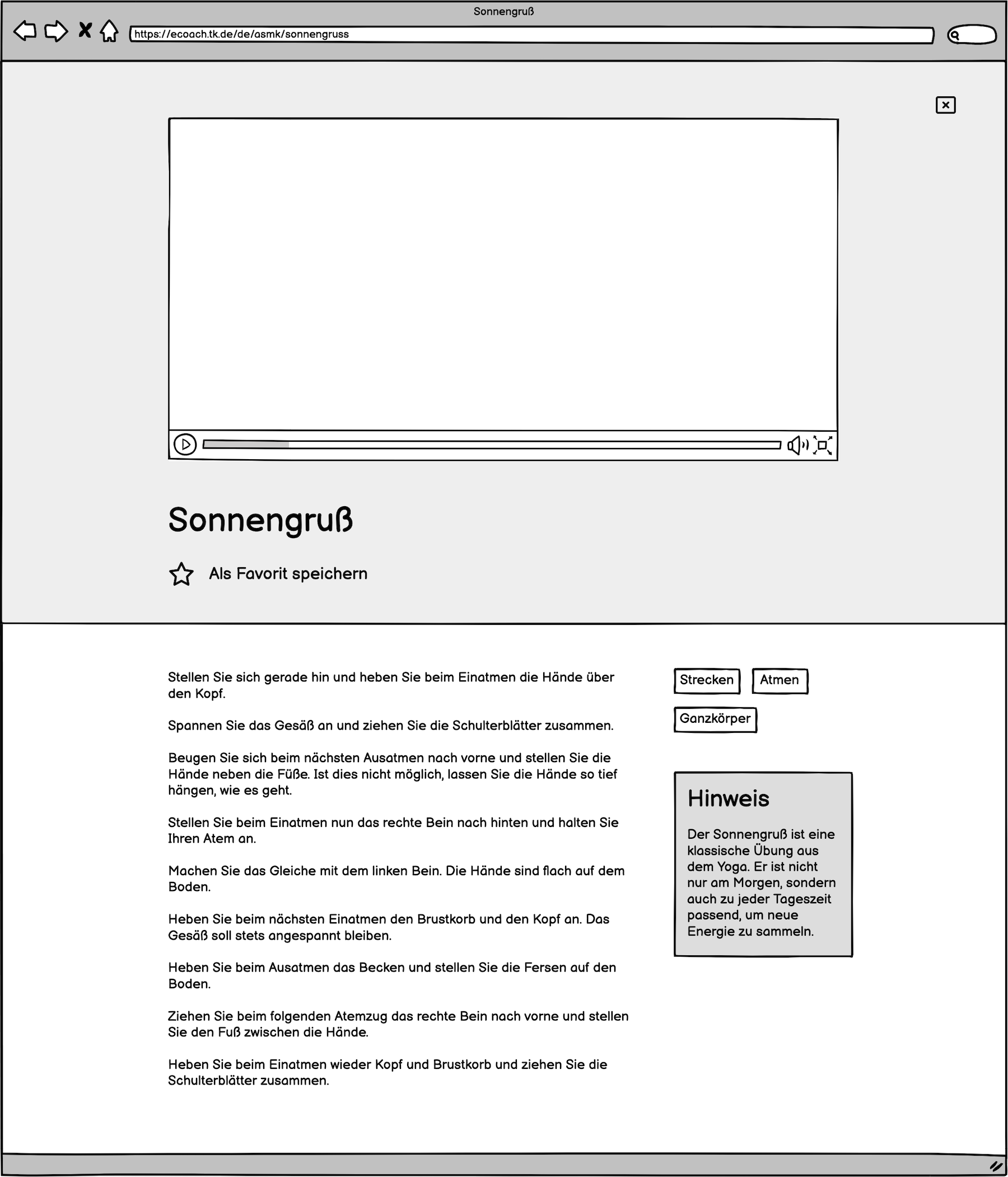
The initial draft was very basic. I kept certain elements from the recipe page, such as the tags feature, so that users could search through the anti-stress techniques according to different categories, and the feature that allowed users to save a technique in their list of favorites. There was also a header video, like in the cookbook, and a block of text describing the technique. It was more stripped down than the recipe page because the content seemed to me to be simpler.
After discussing my designs with the team working on the project, I converted my wireframes into a set of high-fidelity mockups. I sometimes like to present several options when designing a product. I also added the option to leave a review or a rating, so that a user visiting the page for the first time would be able to see how other users had rated the intervention.
In one version, instead of showing tags, I divided the descriptors into different distinct categories: length of time to complete session, type of movement (I was assuming at the time that the interventions would involve physical exercise or stretching), body parts affected or used, and mental effects. This was also somewhat derivative from the cookbook design, where they show at the top of each recipe the time needed to prepare the food, the amount of calories per gram, and the total amount of calories in one serving.
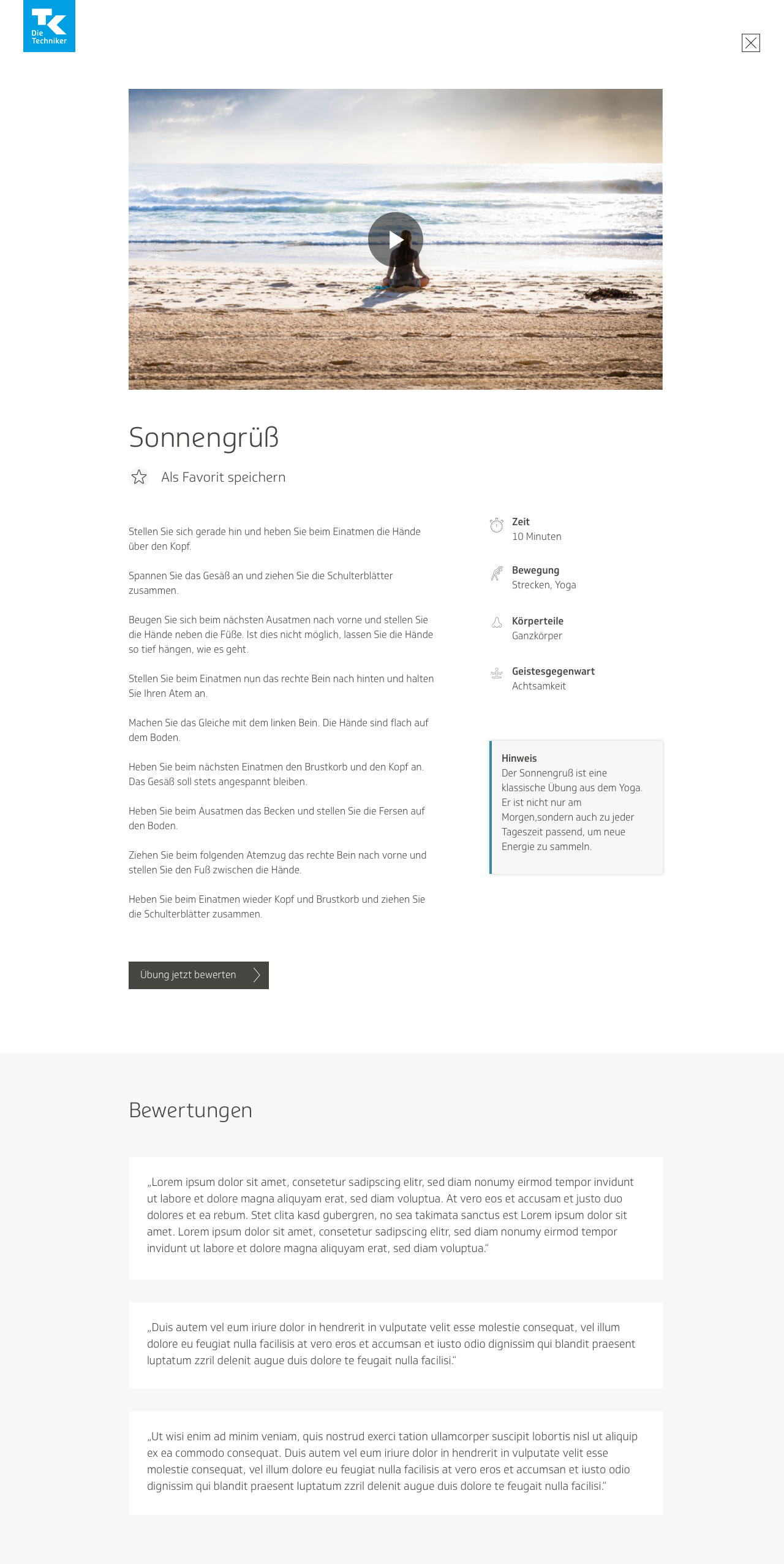
It was all still very much in a rough state, because I hadn’t been given a lot of information yet on how the product would be. Nevertheless, I wanted to make some form of progress and at least get started determining a visual direction for the product, then tweak the information later. The information here is vague because it was not planned out yet; I was more focused on developing an overall visual language for the app than on precisely how the information should be displayed.
The colleagues in my team in charge of content began discussing the possibility of having the anti-stress interventions be more closely intertwined with the rest of the anti-stress eCoach. They wanted to give users the possibility to add an intervention to their list of activities. In my mockups I added a little checkbox that users could tick off if they wanted to do so.
Initial user flows
Sometime after I produced the initial round of visual designs, my team and I had a meeting to discuss how to better integrate Relaxbox with the rest of the anti-stress eCoach. The team wanted to gently guide the user into eventually using the training coach, because they felt it would be more helpful for addressing stress in the long run than solely using Relaxbox. As stated earlier, the exercises in Relaxbox were meant to be used as immediate interventions for combatting acute stress attacks, whereas the training program was designed to see lasting improvement.
As previously mentioned, I worked with a product owner, an additional designer, and two co-workers from the content team on this project. The colleagues from the content team were both psychologists, and they created the anti-stress interventions and wrote all the copy. At the beginning, we had an additional designer there to assist us until I became a bit better acquainted with the eCoach. She eventually left the project. She, one of the colleagues in charge of content, and I conceptualized together a user flow that would allow users to rate an exercise, and if they had liked it, find a similar activity to add to their to-do list of tasks in the training program, and if they had disliked it, search through other interventions in the Relaxbox to find something better.
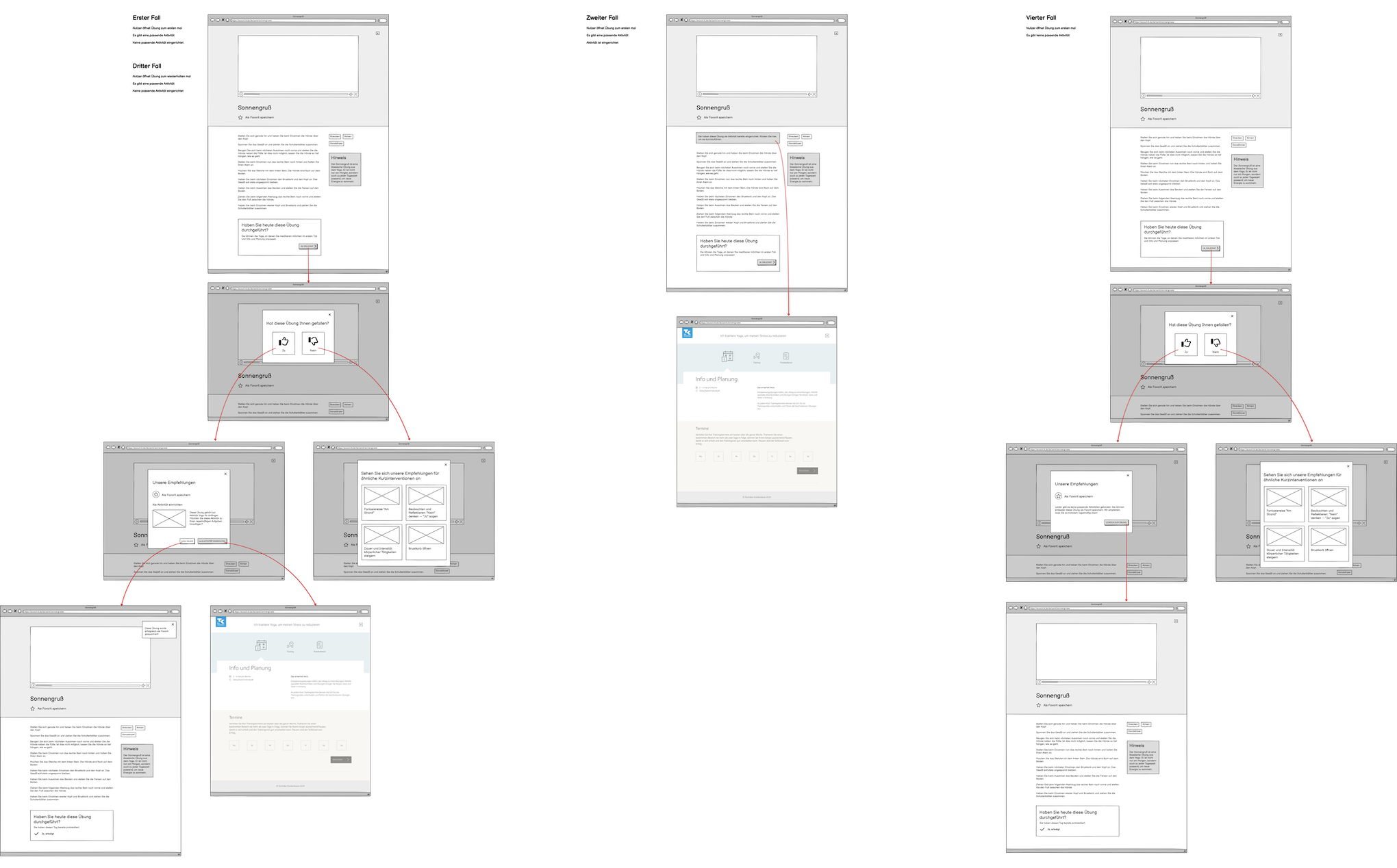
We planned the user flow for four use cases, which are as follows:
Use Case 1
The user is visiting the page for the first time. In their training program, they have not planned any activities that closely align with the exercise. There is an activity that matches the exercise. They perform the intervention and give it a good or bad rating. If the user gives it a good rating, they can either plan that activity in their training program, save the exercise in their favorites, or exit and return to the exercise page. If the user gives it a bad rating, they can search through other exercises until they find one better suited to them.
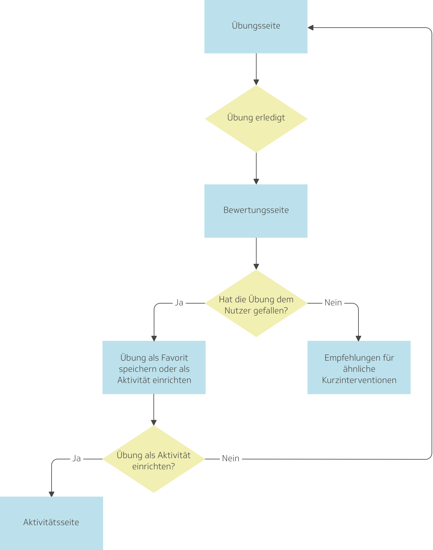
Use Case 2
The user is visiting the page for a repeated time. They already have a similar activity in their training program. The user navigates their way to the page for that activity, where they can perform it and mark it as done for the day.
Use Case 3
The user is visiting the page for a repeated time. In their training program, they have not planned any activities that closely align with the exercise. There is an activity that matches the exercise. They perform the intervention and give it a good or bad rating. If the user gives it a good rating, they can either plan that activity in their training program, save the exercise in their favorites, or exit and return to the exercise page. If the user gives it a bad rating, they can search through other exercises until they find one better suited to them.
Use Case 4
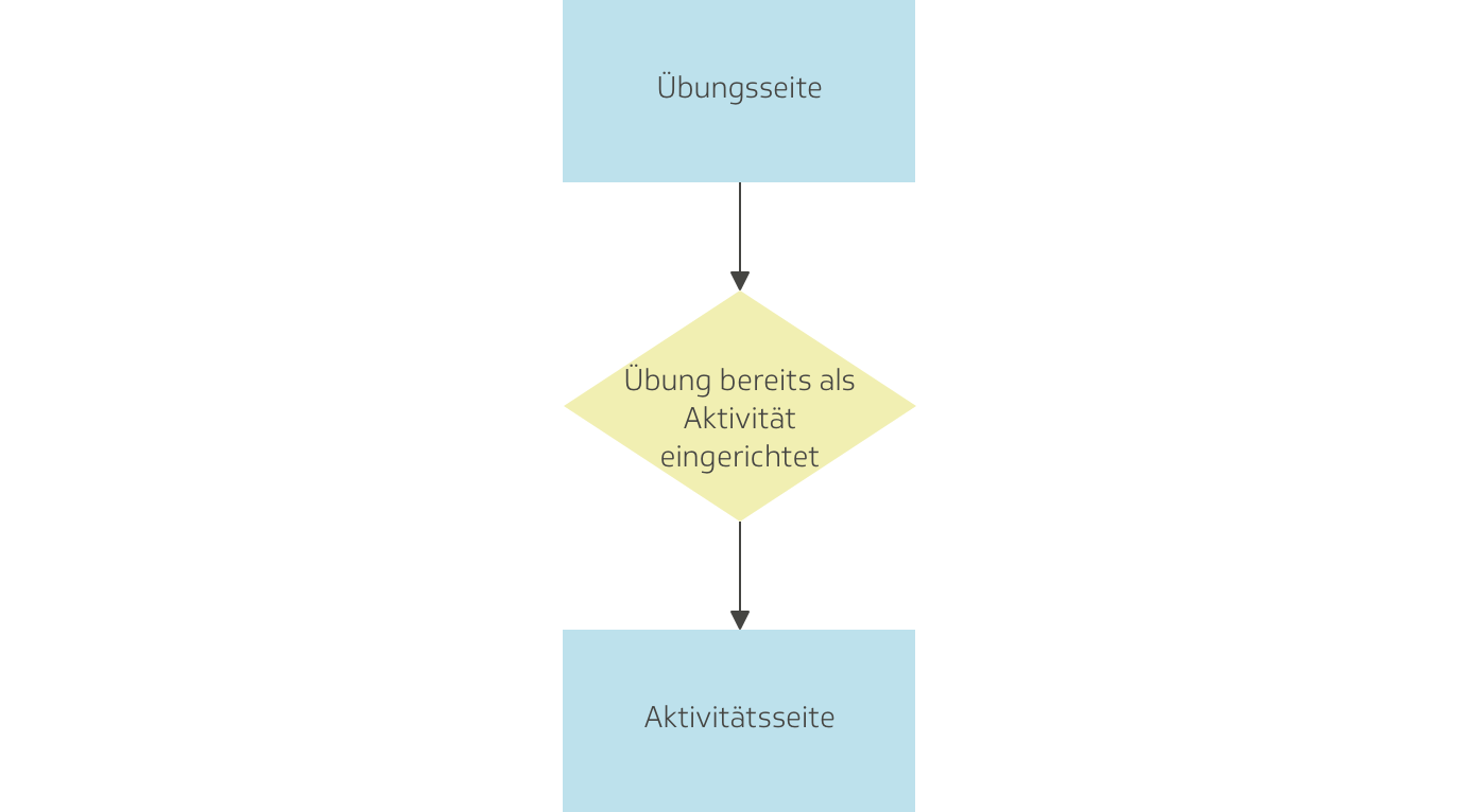
The user is visiting the page for the first time. There is no activity that matches the exercise. They perform the intervention and give it a good or bad rating. If the user gives it a good rating, they can either save the exercise in their favorites, or exit and return to the exercise page. If the user gives it a bad rating, they can search through other exercises until they find one better suited to them.
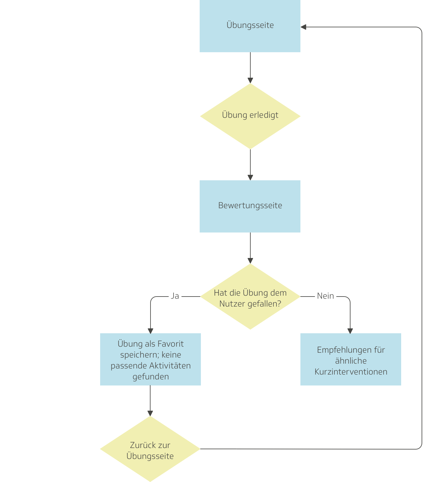
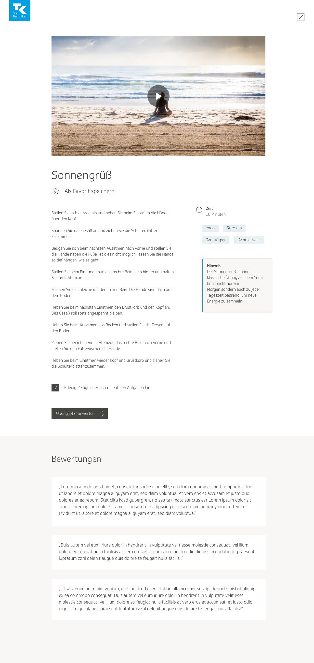
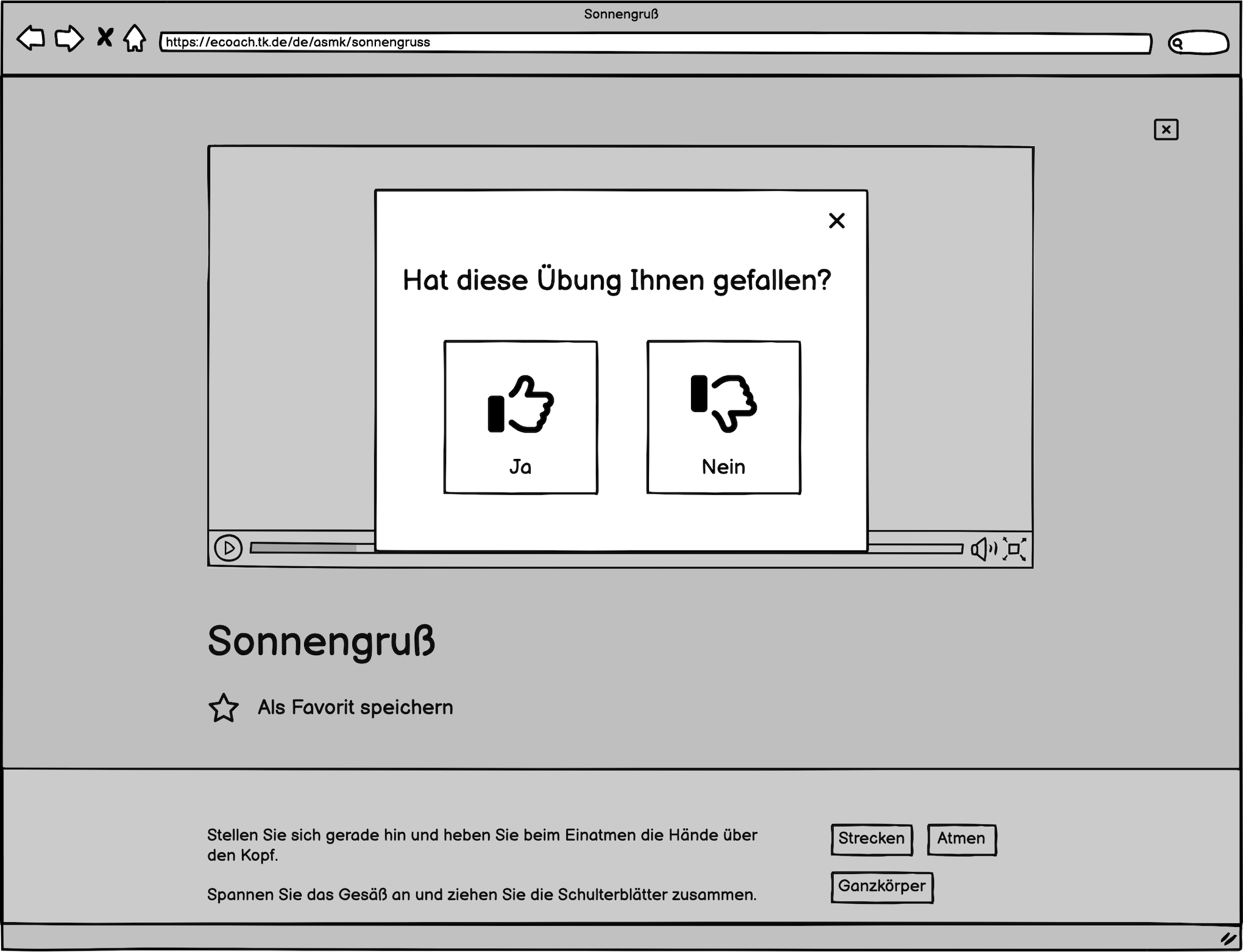
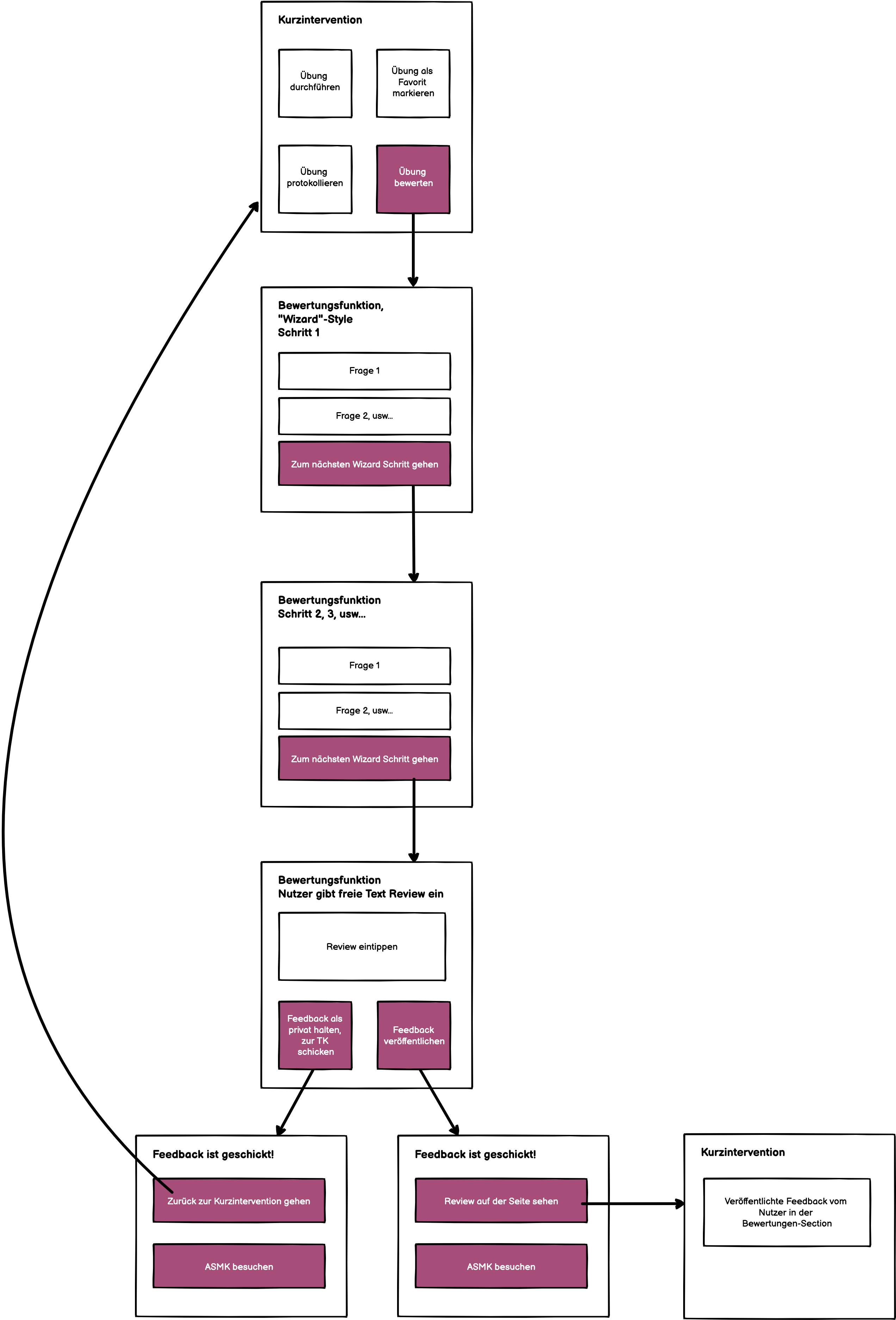
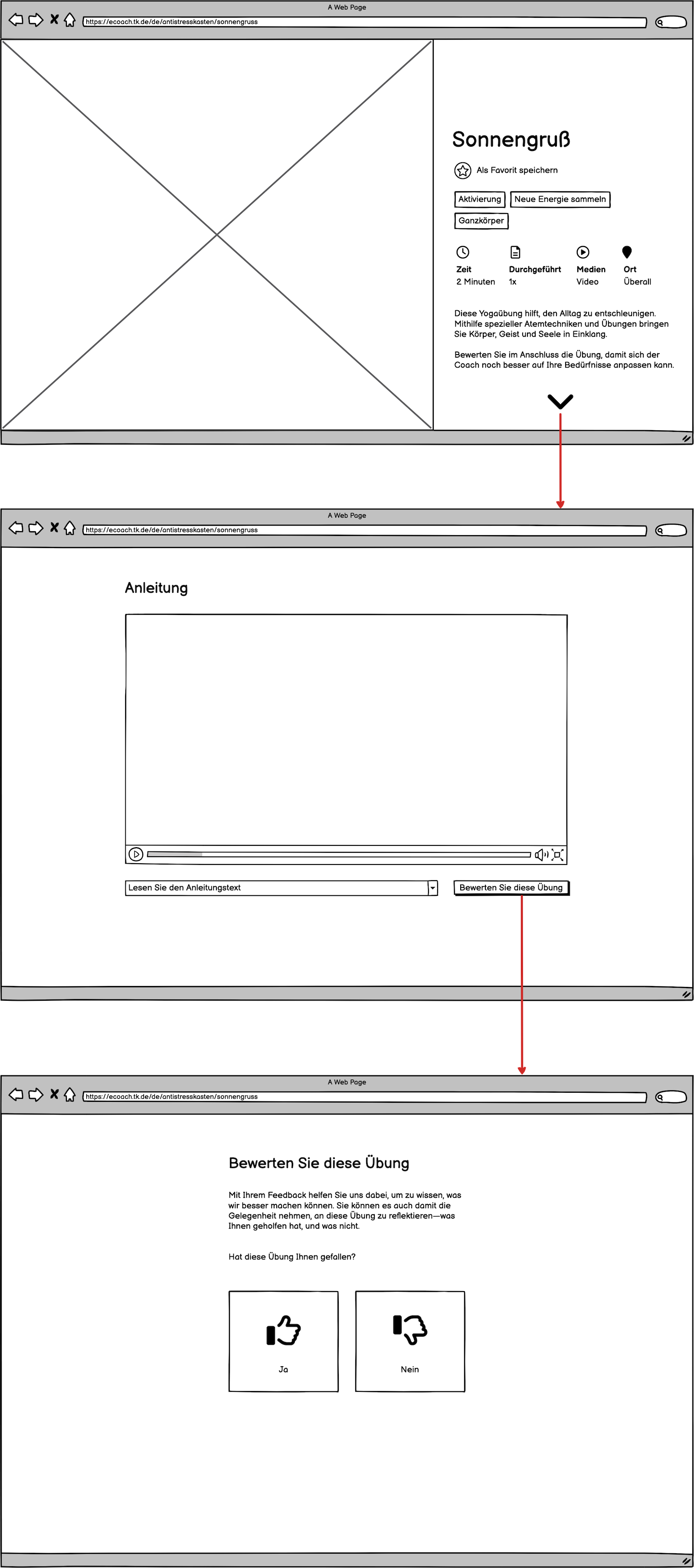
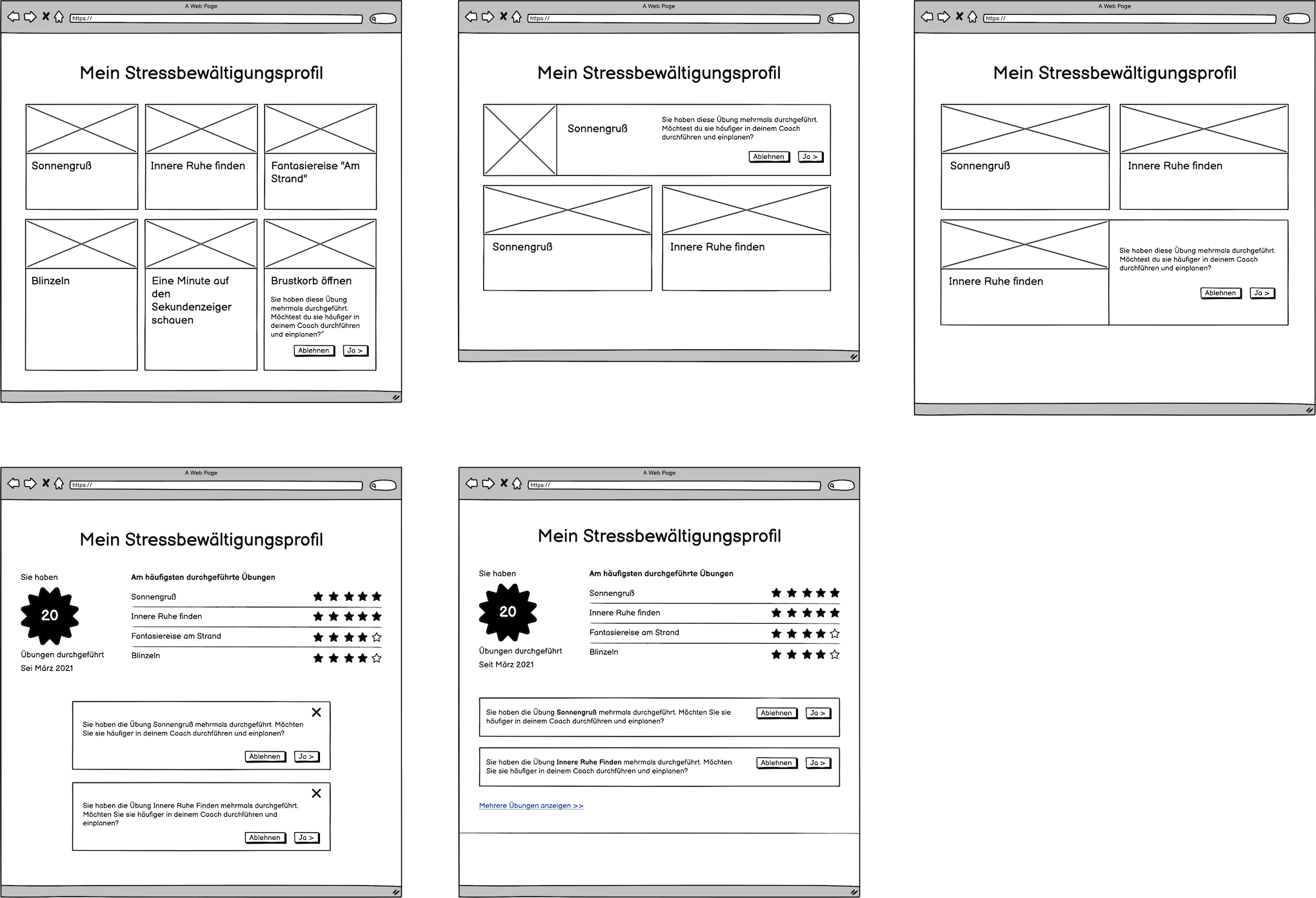
I then took the user flows and designed new wireframes based on them. I updated the template for the individual exercise; now it had a notification box at the bottom of the page, telling users that they could rate the exercise, add it as an activity, and mark it as done, as well as a button for them to click on, which would open a modal window where users could perform these actions.
Clicking on the “Ja, erledigt”—which means “yes, finished”—button would lead the user to a modal window where they would be able to rate the exercise with a thumbs-up or thumbs-down.
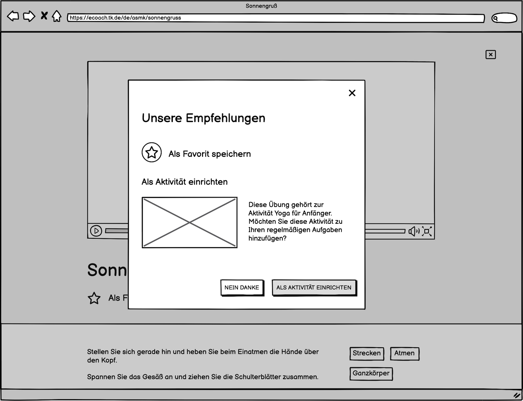
Selecting the thumbs-up would direct the user to a second modal window where they would have the option either to plan a similar activity as part of their training or to go right back to the page for the exercise, where it would show that it has been rated. The user would also be able to save the exercise in their favorites, if they wanted to. If no similar activities exist, the user doesn’t receive the option to plan any activities, but rather, only a message notifying them that no suitable activities have been found.
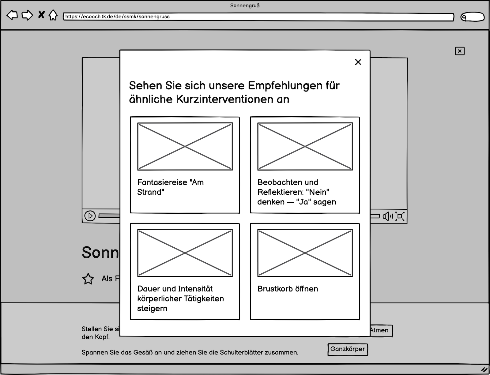
If the user gave a thumbs-down rating, then they would be directed to another modal screen where they are shown recommendations for similar exercises in the Relaxbox that might suit their needs better.
I then arranged the screens in user flows to demonstrate to the rest of the team how it would all work together.
One important lesson I learned from this project was never to start on the visual designs at such an early stage in the process, and to always have a defined user flow first. The process would have been a lot more efficient and less lopsided had I focused on gathering information about the project and planning out the user flows and wireframes first.
First round of visual designs and user testing
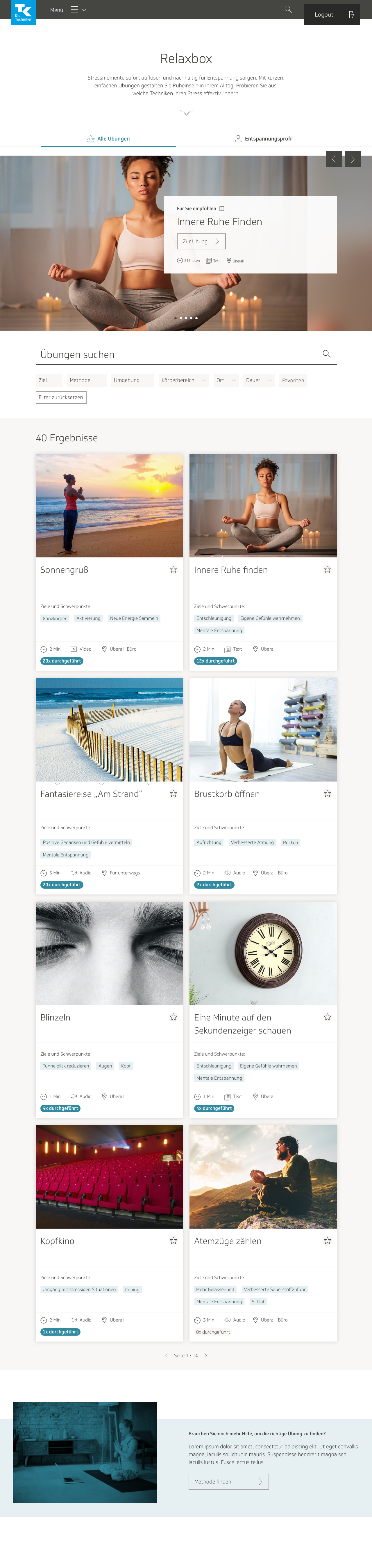
After receiving the team’s approval, it was time to proceed with the first round of visual designs for all screens. I modeled the main page for Relaxbox after the cookbook, with only minimal changes.
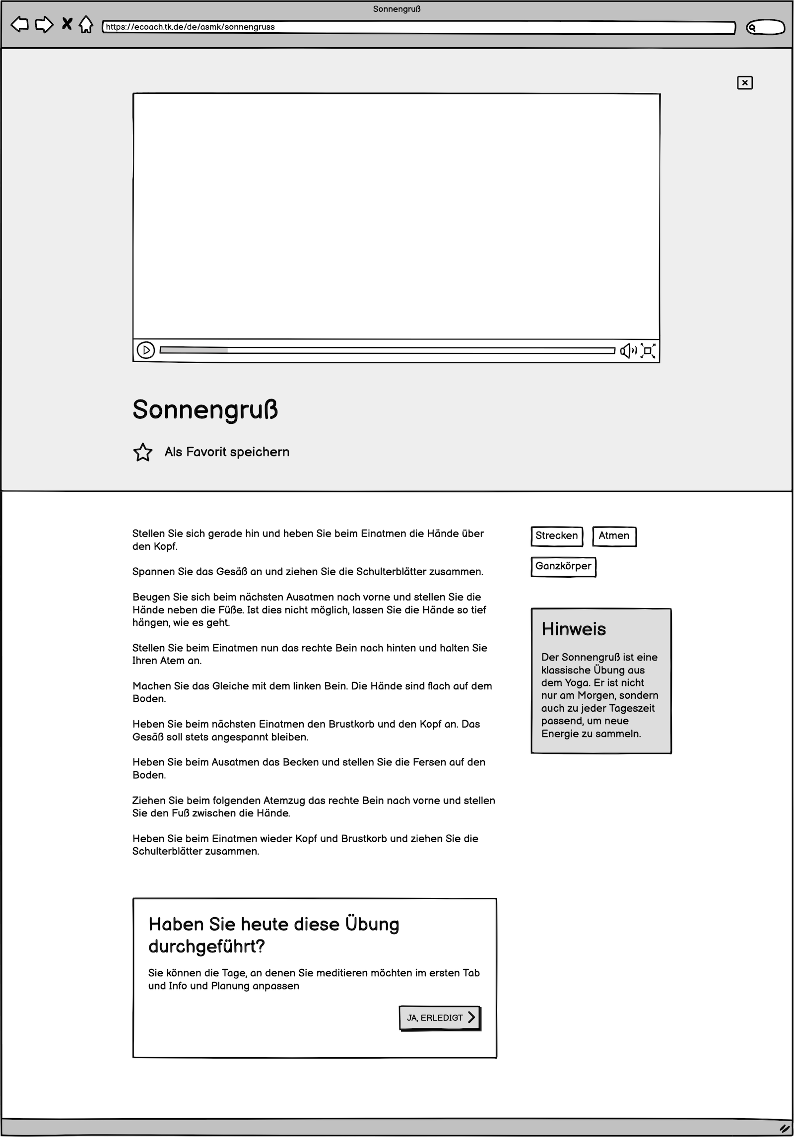
I made a few minor stylistic changes to the individual exercise page; it now resembled the recipe pages in the cookbook more. I also added the section at the bottom where users could click a button to review the exercise and mark it as done.
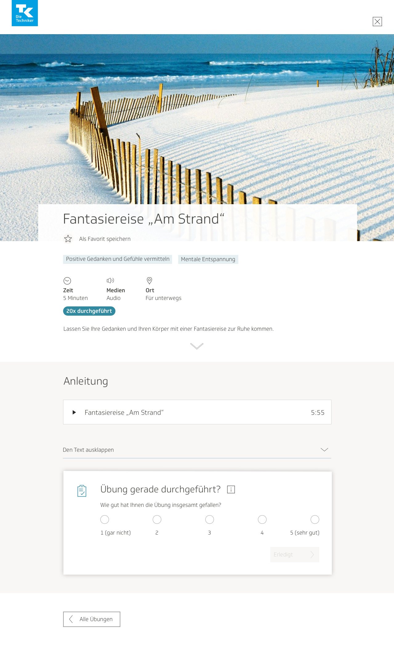
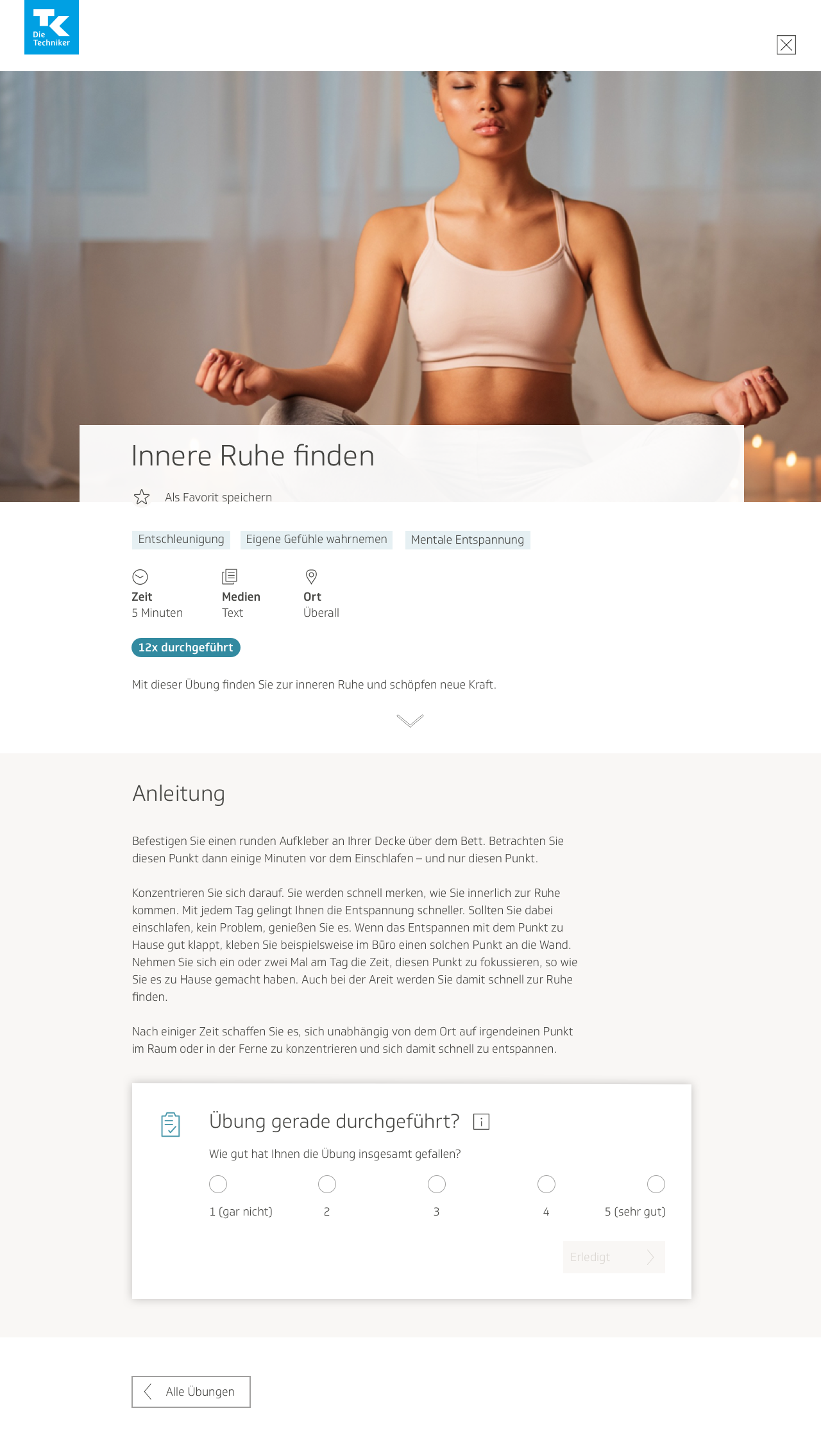
I learned that there would be three different types of media for the exercises, not only videos. There would be text, video, and sound. I included the type of media at the beginning of each exercise, as well as time needed to complete the exercise, how many times the exercise has already been performed by the user, and the location(s) where the exercise could be completed. The team and I collectively decided that these attributes would be important for the user to immediately know whether this exercise would be suitable for them or not.

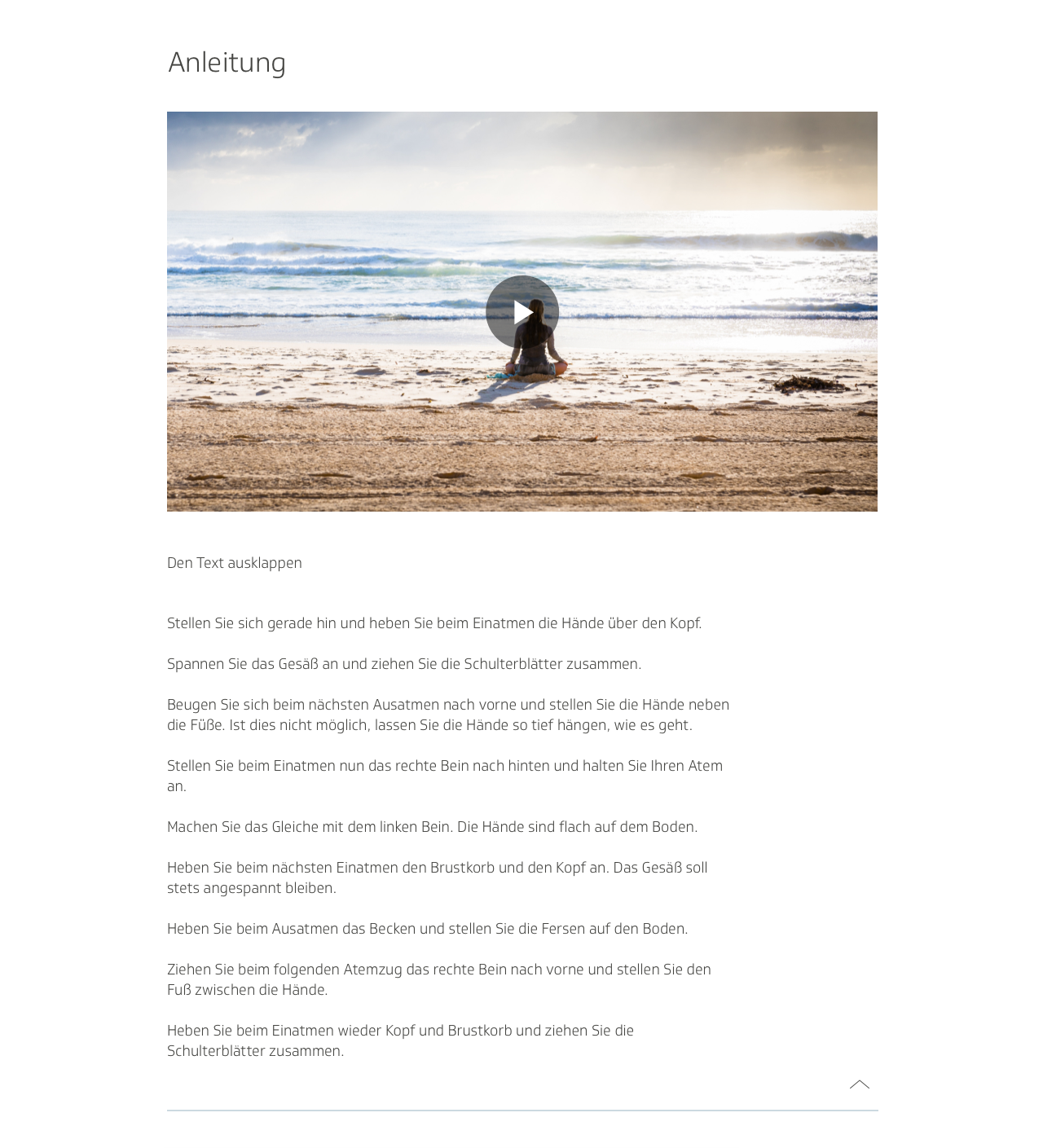
I also needed to design the pages for sound and text media. For the sound page, I experimented with different placements for the media player, before deciding on the one below. I left the text description up for both the sound and video pages.
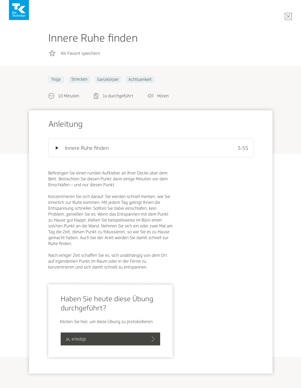
The text-only page was simple enough. The design below also showcases how the page looks when the exercise is already planned as an activity, and when the user has just marked it finished:
I also put together the designs for the modal screens where the user can rate the exercise, save it as a favorite, plan a similar activity, and where the user is offered a recommendation of similar exercises.
Once the mockups were done, we conducted our first round of user testing. Using the designs for the screens and their different states, I put together a click dummy with Invision, and we arranged appointments for employees of the TK to test it. One of my colleagues from the content team and I devised a test that was both qualitative and quantitative. We gave the users tasks to complete, such as “complete an exercise and mark it finished,” or “plan an activity to do that is similar to the exercise.” We would also propose various scenarios: “You just finished the exercise and didn’t like it. What do you do next?”
My colleague and I hosted each testing session together. One of us would walk the user through the test and give them the prompts, and the other would watch the user interact with the product, and take notes on what the user was doing. We also had the user narrate their entire thought process out loud, and took notes on that as well. After watching them respond to our prompts, we would ask them questions about how they felt using the product. Our test involved both observing the users’ actions and recording their feelings; our data was both objective and subjective.
Implementing user testing feedback
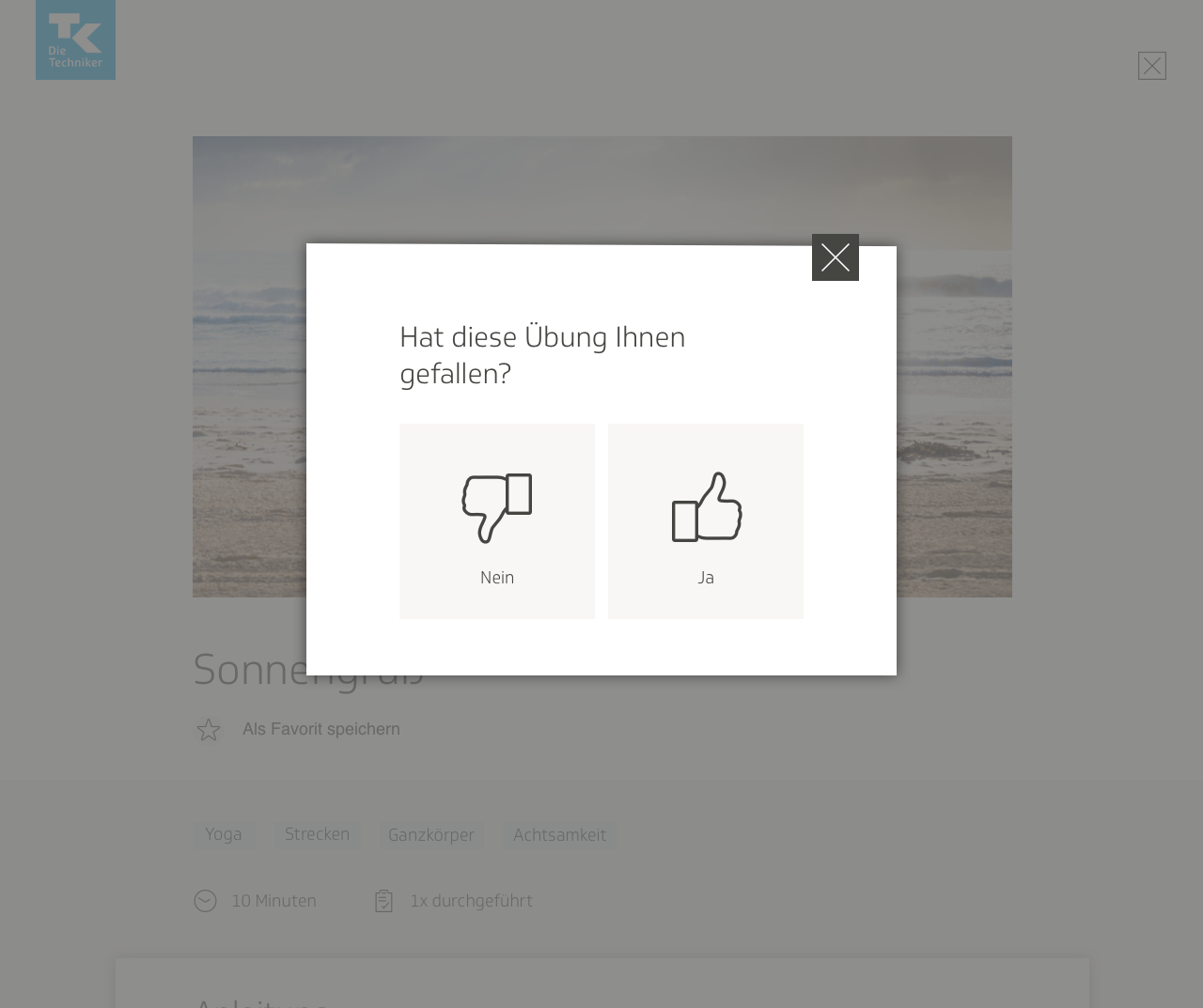
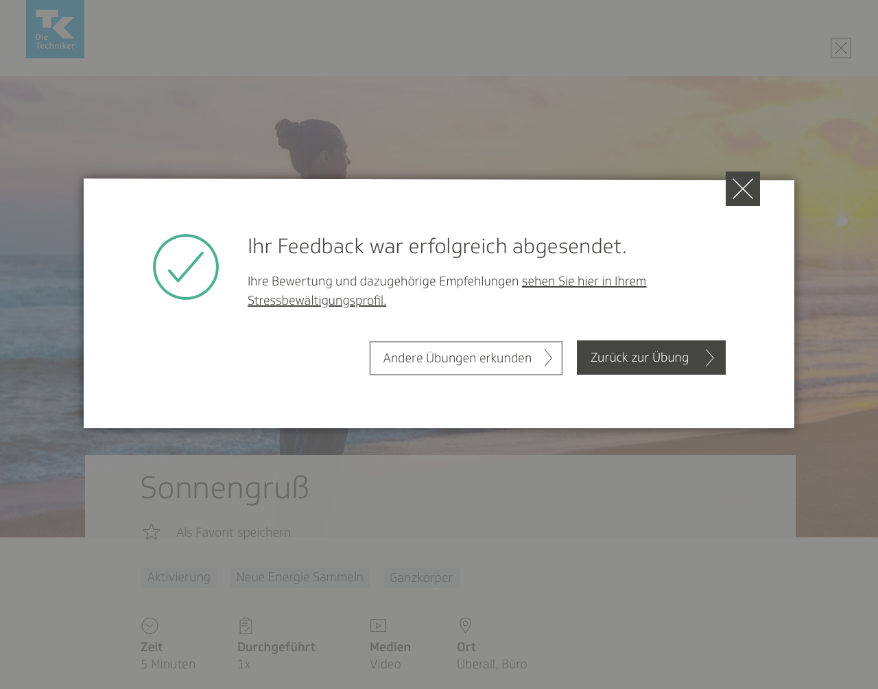
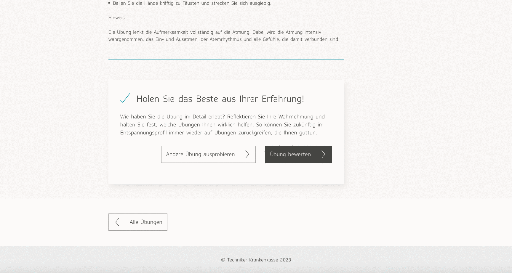
The biggest takeaway from the user testing sessions was that the process of trying to add a Relaxbox exercise as a training activity was too complicated for users to understand. We decided to keep the activities and Relaxbox completely separate from each other after all. However, the users liked the ability to rate each exercise, so we kept that feature…and expanded it.
Our users gave the feedback that they would have liked for the feature to be more of an introspective process. Managing stress is a very personal issue, one that requires a person to reflect on what is causing them stress. We decided rather than limiting the rating just to a thumbs up or down, we would guide them through a questionnaire where they could provide more detailed feedback on what kind of stress they were experiencing and how the exercise helped them—or not.
While my colleagues in charge of content began drafting a list of questions for the feature, I got to work, planning a user flow for how this feature would function.
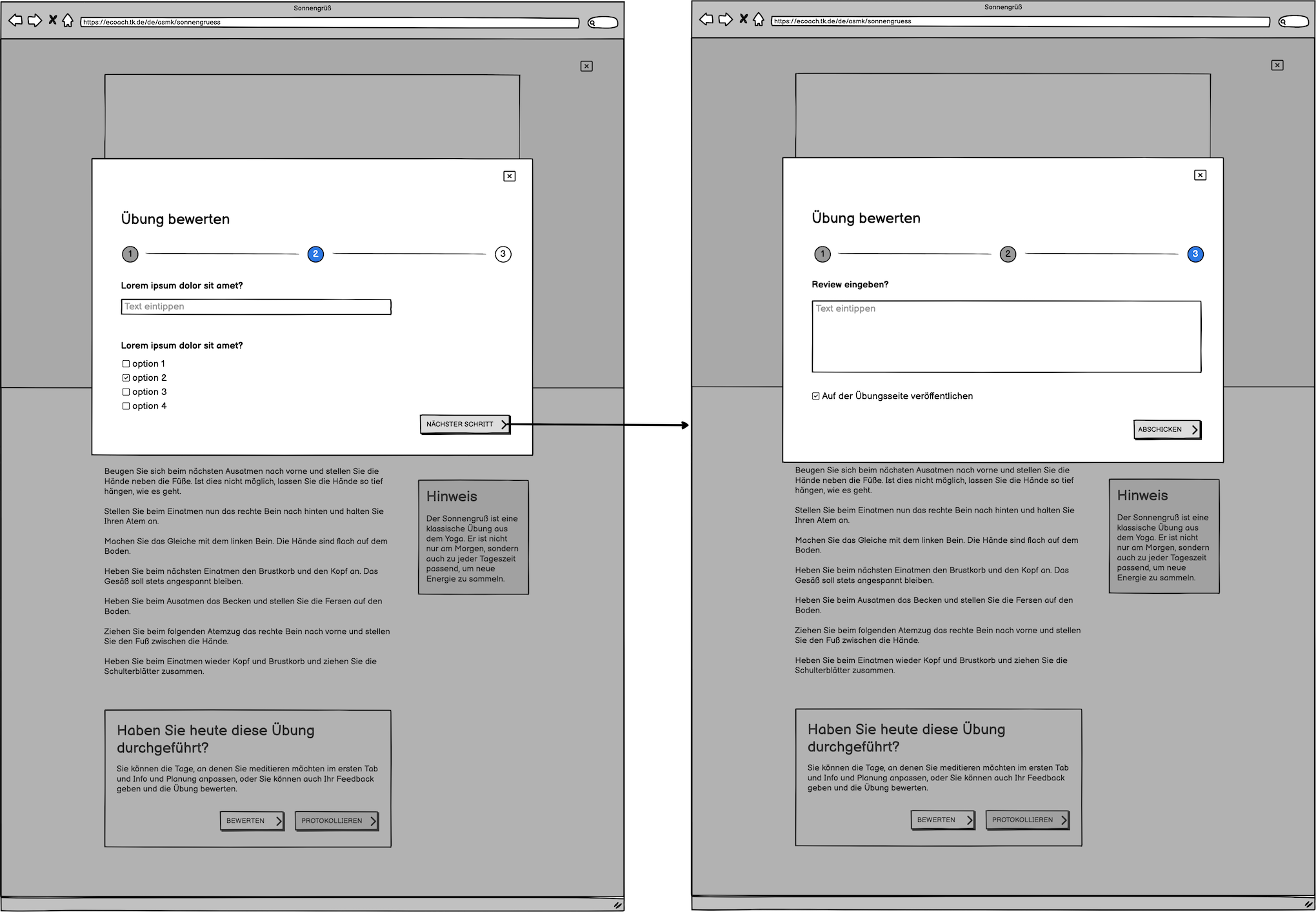
I decided to use a wizard format. For surveys and questionnaires, I have found that this format works well. Dividing long lists of questions into different categories and pages helps users digest them better.
Initially I wanted to have a free text field, and not limit the survey exclusively to questions with multiple-choice answers. I figured it would be a more satisfying user experience overall if users also had the option to get more specific in their feedback. However, my colleagues from the content team said that would be an issue, because then the text would have to be moderated. They were concerned about users potentially disclosing suicidal ideations, and did not want to deal with that liability.
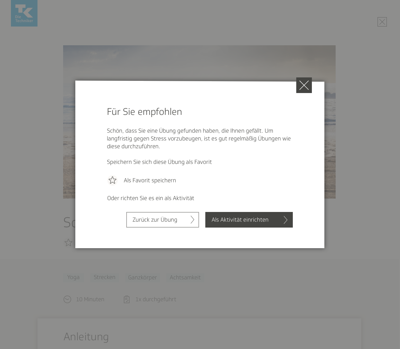
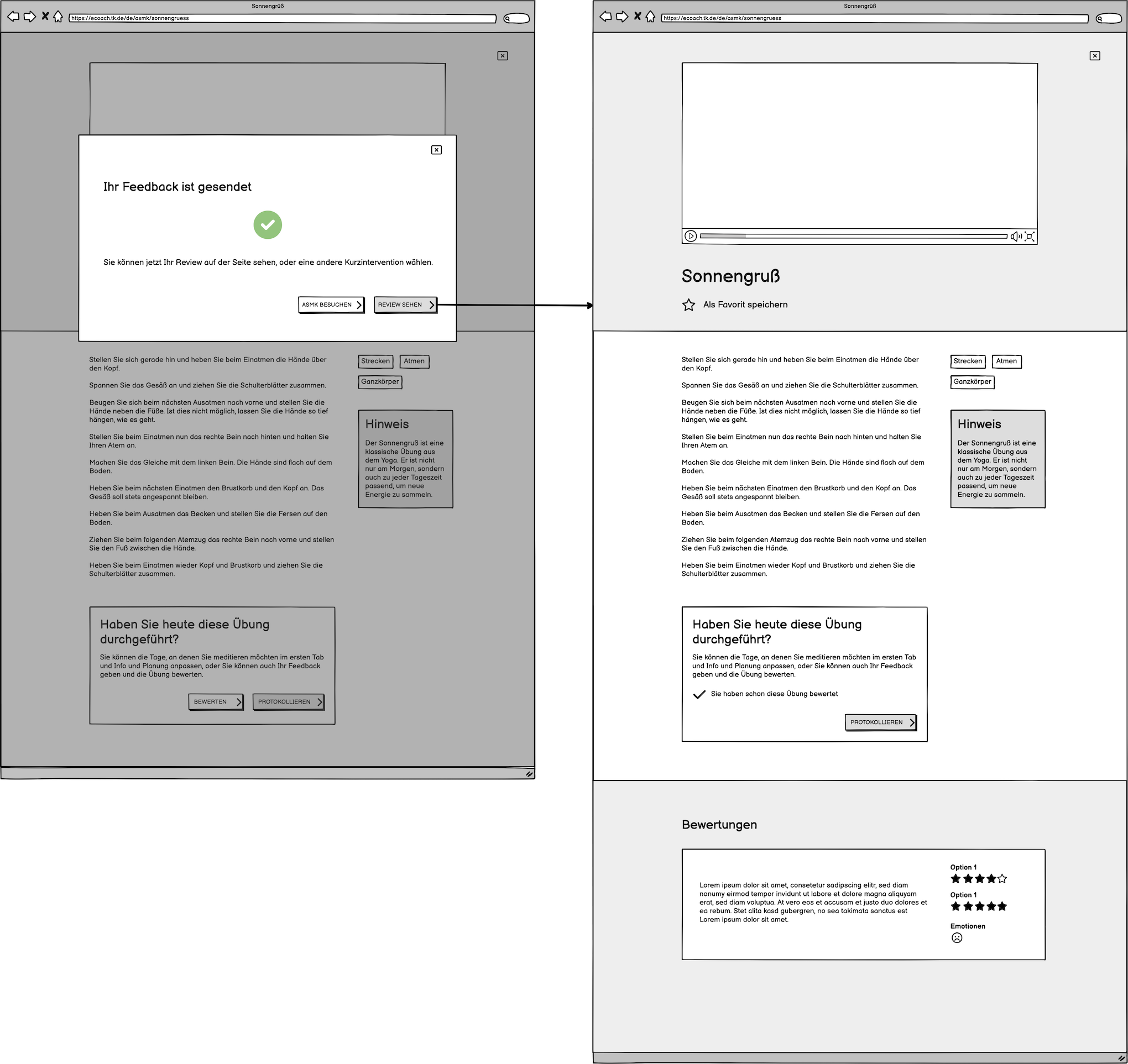
Once the user had completed the questionnaire, they would have the chance to publish their review publicly on the page, or keep it private and have it sent to the TK instead. Part of the reason why I advocated for the review process was also because I figured it would be a good way for our team to collect feedback on Relaxbox and figure out where it required improvement. Having the reviews visible on the page would also help other users decide if this exercise was worth trying.
A couple of users also found the overall structure of the individual exercise page confusing. They said they were confused by what to do, where to start, and what they were looking at. To make it less obfuscating, my team and I decided to add a small description at the top of the page, no more than several sentences long. I also added a clickable arrow after the description, which would automatically scroll the user down to the exercise description and the media.
On the exercise pages containing videos and sound clips, users complained that they did not want to have to scroll through a transcript of the entire text. I solved that problem by containing the text within a dropdown. We also felt each page would be more inviting if it had a header image, one that would also be displayed in the thumbnail that corresponded with that particular exercise on the main search page.
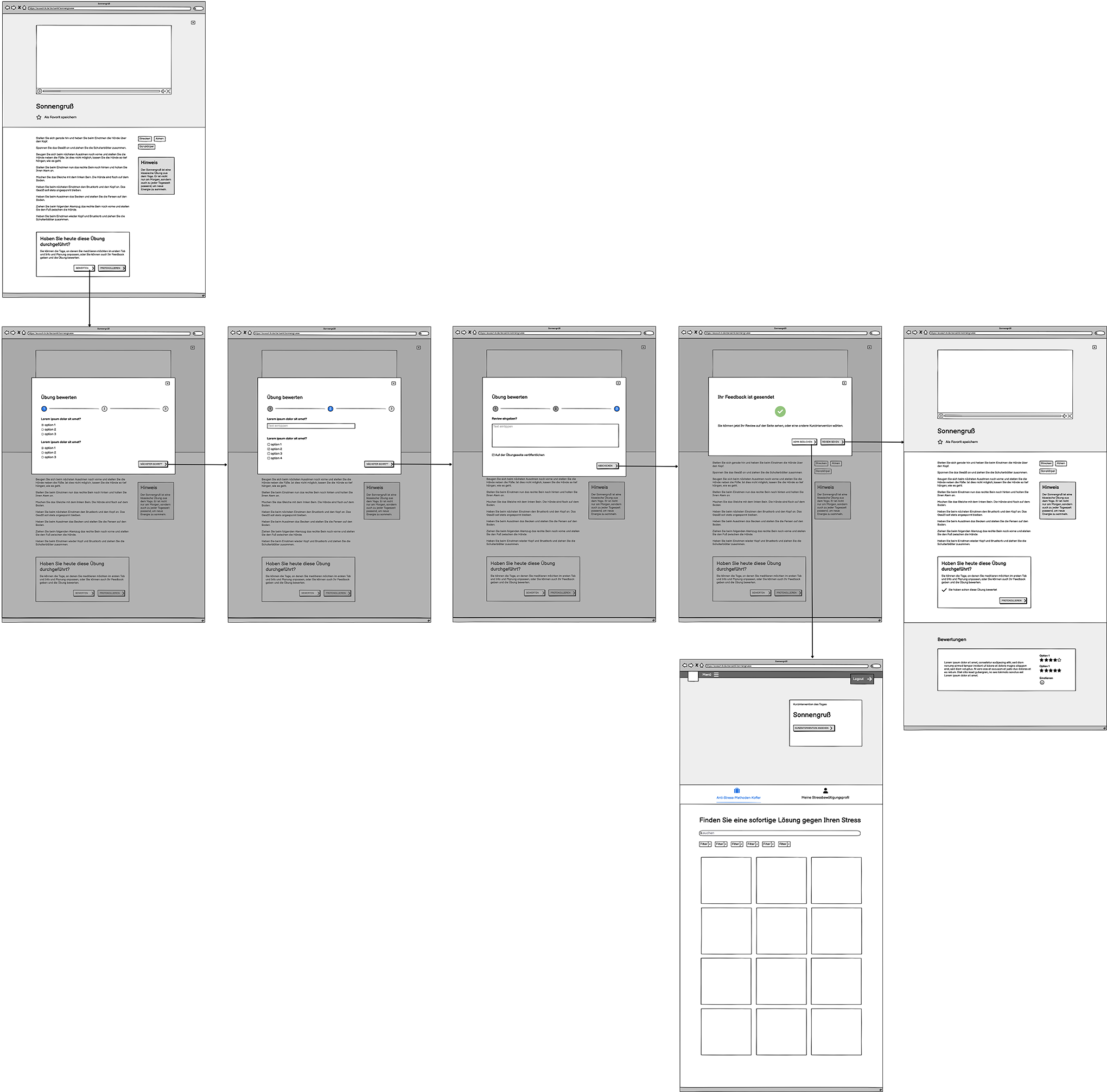
In order to account for all these changes, as well as the new, expanded rating function, I wireframed the page all over again, producing several variants to present to the rest of the team.
In order to make the contents of the page easier still for the user to parse, I divided it into separate sections with different-colored backgrounds. In the first variant, I had each section occupy the entire length of the screen, using buttons and icons to help the user jump from one section to the next. I also experimented with the section where the user could rate the exercise, seeing how it would be to have it as its own section on the page instead of a modal window. The team ultimately decided however that they preferred my modal window design.
The second variant layout was a bit closer to the original; it contained the header image stacked on top of the introductory text and category descriptions.
I assembled some of the screens together in a user flow to show how the rating wizard modal would function. Just as in the previous iteration, the user would click on a button at the bottom of the exercise page in order to access the review and rating feature, which would then open up in a modal window. Then, instead of seeing the option to click thumbs up or thumbs down, the user would be met with the first screen of the questionnaire. The user would then be guided through several screens of reflective questions, and possibly even free-text fields; the content had not yet been determined. Once the user had submitted the questionnaire, they would then either be able to return to the exercise page and read their review there, or they would have the opportunity to browse more exercises on the search page.
User profile
Since we were already expanding the rating and review function into a more introspective process, the content team and I felt it would be a good idea to add a personal profile to Relaxbox, where the information that users submitted in the questionnaire would be shown. The purpose of this would be for users to record their responses to each exercise and be able to look back on every entry, reflect on what types of exercises helped them the most, track their progress at managing stress, and motivate themselves to develop good habits.
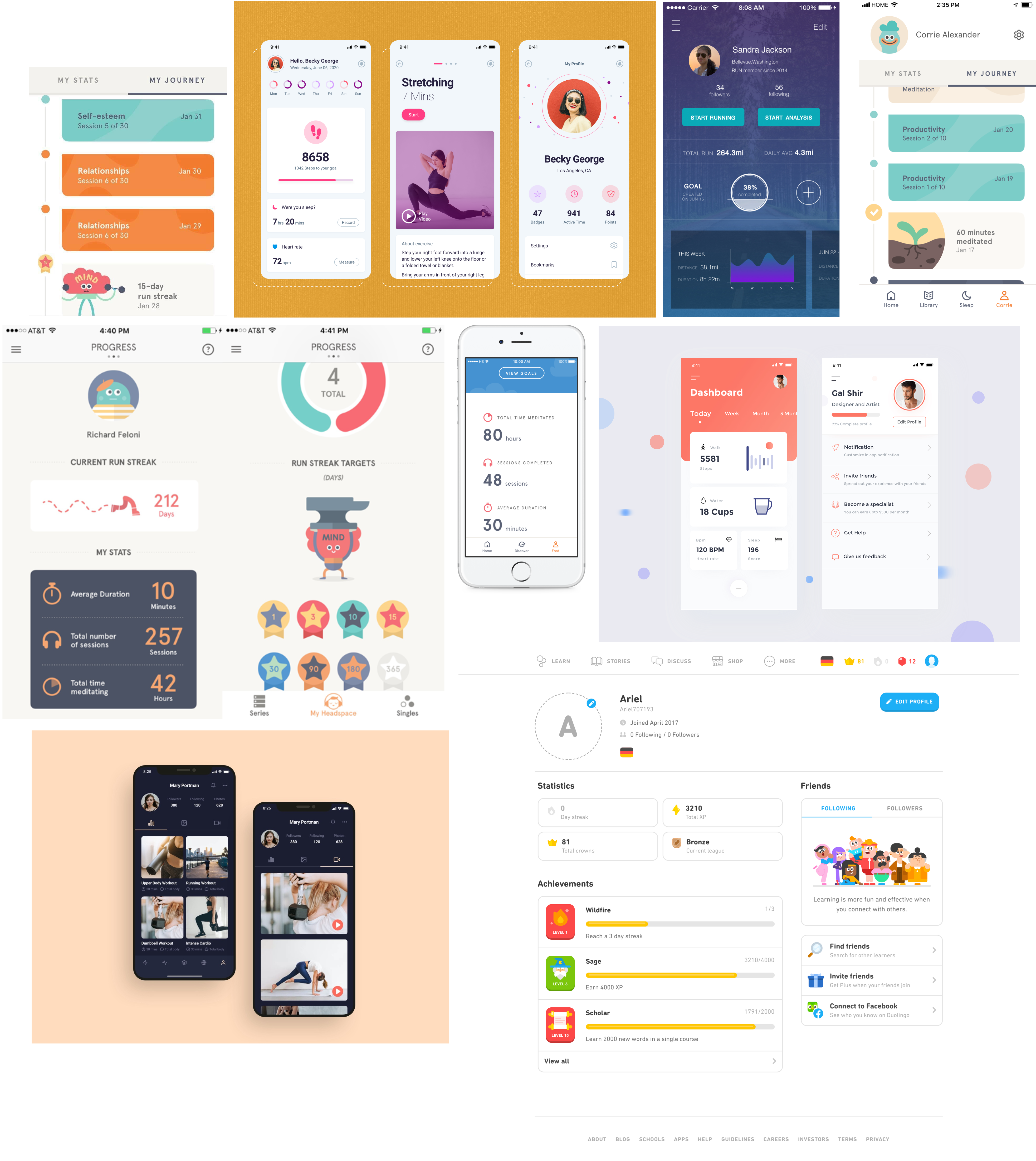
For inspiration, and to get a idea of what was already out there, I conducted research on apps with similar features. Doing this kind of research is an important step in acquiring a sense of what users’ expectations are when they use features such as these. I looked primarily at exercise apps and mindfulness apps, but in general focused on apps that provide a sense of accomplishment when used consistently, such as Duolingo.
A few key observations I made were:
- Oftentimes, a profile would begin with a general quantitative overview of the user’s activity on that app, such as how many times a user had performed a specific task, or how much time a user had spent on a task in total.
- Some apps used timelines, which would not only show what the user did or how much of something the user had done, but also when the user had done it, in chronological order, thus giving a sense of being on a journey.
- The concept of a streak was also frequently used—when a user had an unbroken streak of time where they performed a specific task every day, the app would show it.
- Many different types of information design were used, such as charts, graphs, illustrations, and progress wheels and bars.
- Gamification tactics were often employed.
I was wary of making the experience too focused on performance, and avoided gamification. I wanted users to feel a sense of accomplishment and progress, to motivate them further in improving their mental health, but I also didn’t want the app to feel competitive. The point was to help users feel more relaxed, not pressured to perform.
We would show data using the information the user would submit in the questionnaire, such as what type of exercises helped most, or how it helped the user. After acquainting myself better with this type of content in other apps, I brainstormed ideas for what we could show, as well as how the information could be displayed. Would we use charts or graphs? Illustrations? Lists? I love information design, and rose to the challenge with joy.
The first iteration of the wireframe included an overview section at the top of the page, a graph that showed the most frequently used exercises, subjects of particular focus—such as meditation or yoga exercises—and a list of recommended exercises based on ones the user had liked.
I produced another wireframe containing an evaluation graph. The early iterations were very sketch-like and focused on brainstorming ideas more than anything. I envisioned a page filled with widgets and graphs containing data submitted by the user.
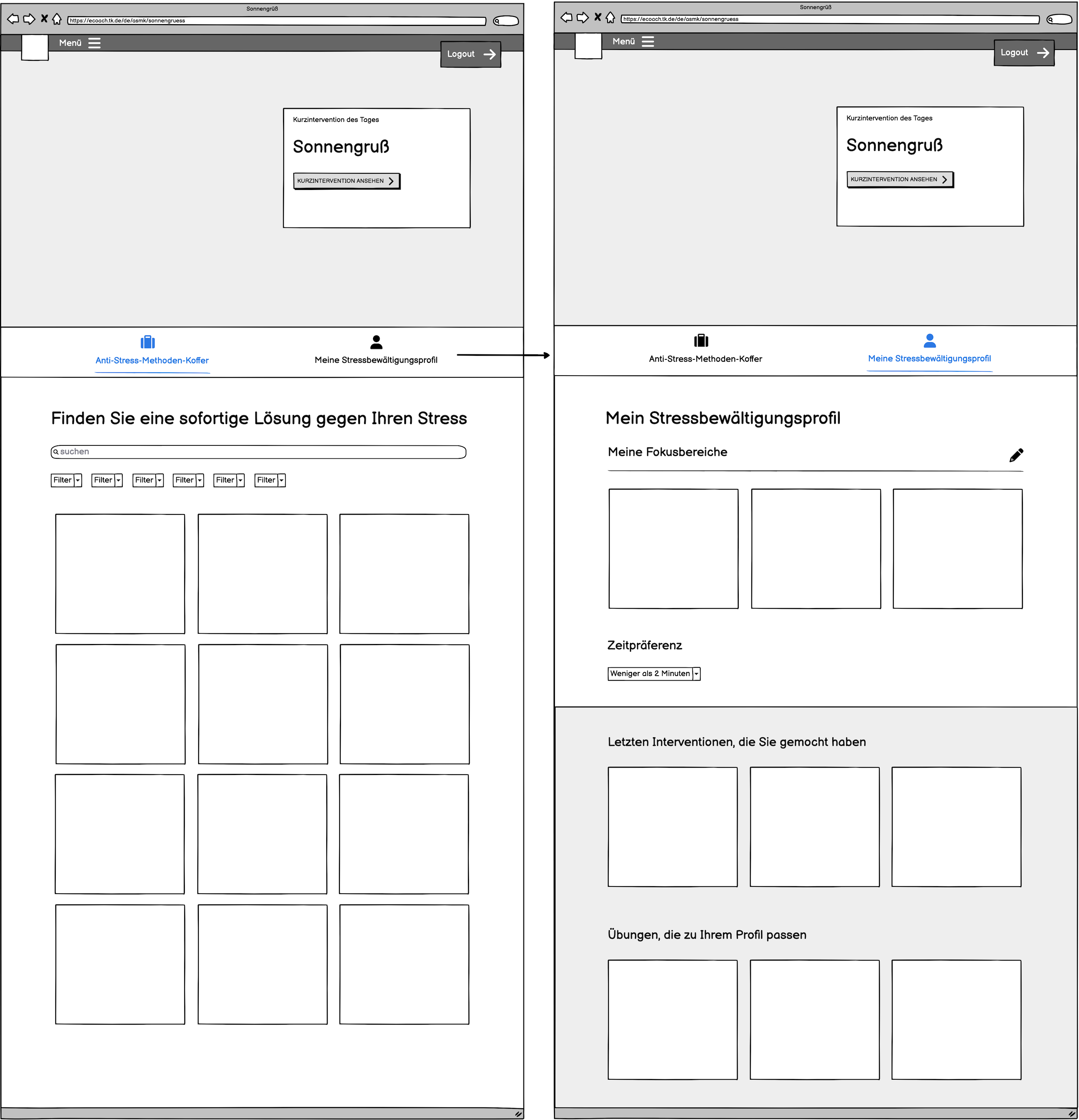
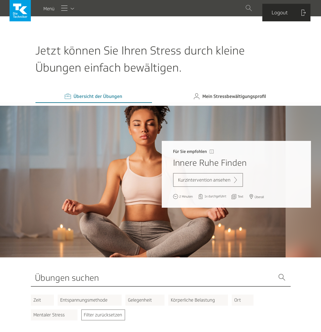
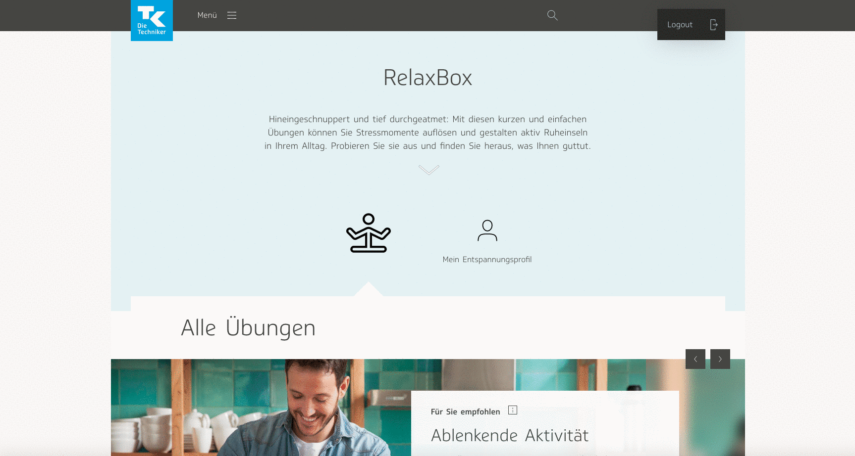
I also decided on access points for the user profile. I wondered whether it should be its own separate link in the navigation menu, under the section where users could see their personal data for the entire eCoach, but then decided it wasn’t of enough importance to include there, and should be localized just on the Relaxbox page itself.
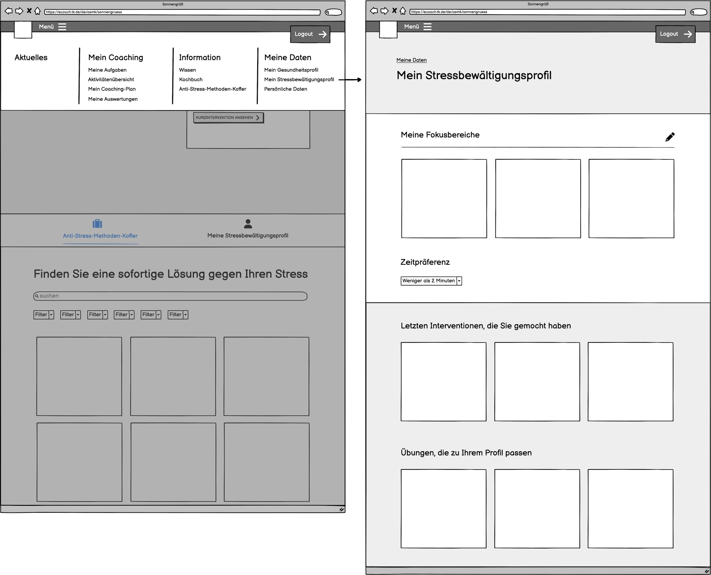
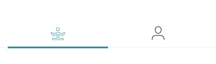
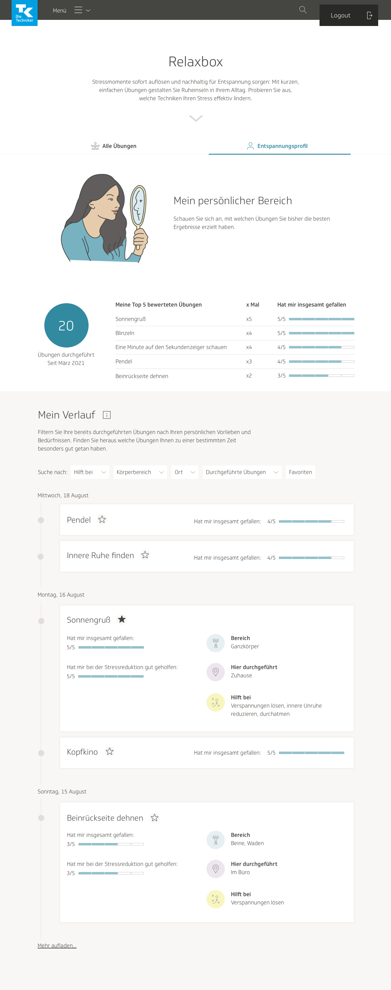
I restricted the link exclusively to the Relaxbox page. I planned it such that that the main page of Relaxbox would have two tabs at the top: the overview where users could browse techniques, and the profile.
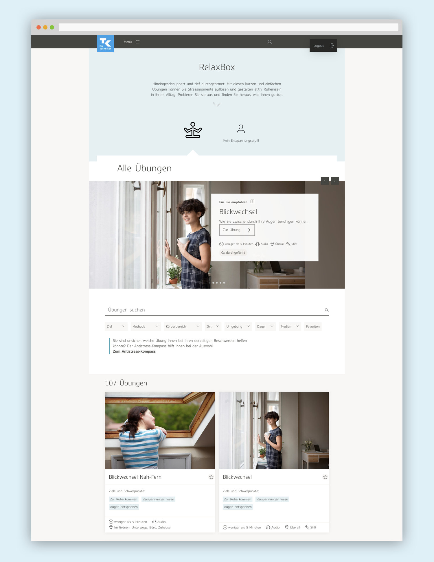
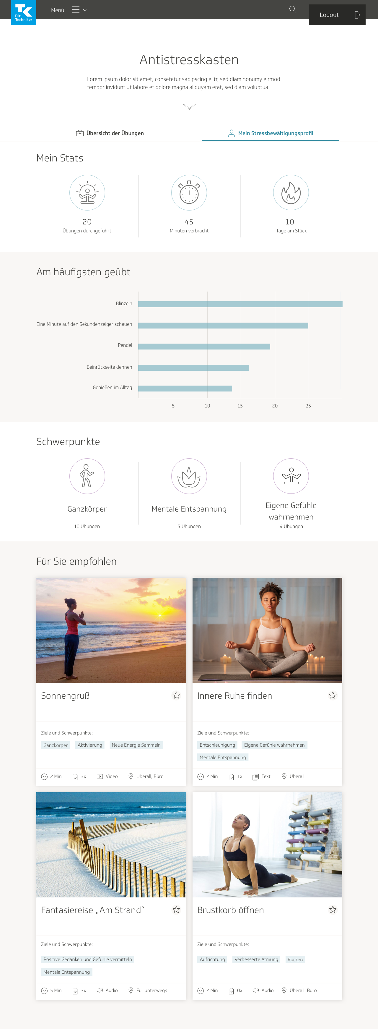
Visual design for overview page
With all the user testing results and new features that were planned, there were lots of visual design developments that needed to be made. On the overview page, I separated the stress management profile and index of exercises into two separate tabs. The content editors had added another category that would need to be shown for every exercise preview on the overview page: the location where the exercise should be practiced, such as home, office, out and about, or anywhere. I made the preview thumbnails wider to accommodate that; now they occupied two columns instead of three. We also decided to show the category tags in the thumbnail preview, to help the user make a more informed decision on which exercise to try.
We had received feedback during the user tests that it was not entirely clear what they were looking at or where to begin. To clear up confusion, I added a heading to the top of the page. The slideshow was also moved from the top of the page and made into a part of the exercises section, and the tabs were bolded for visibility.
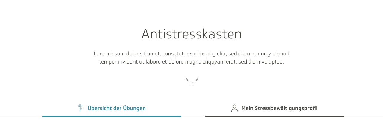
I experimented with the properties of the heading. One version had a descriptive heading, other versions had the name of the product itself. We held several workshops around this time to try and find a better title for the product, and Antistresskasten—which means anti-stress box—was a title we were considering.

In the end, we added an introductory blurb.
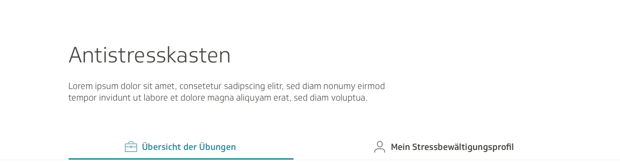
The final version had the header and blurb centered, to give it some more focus. I also added a clickable arrow that would scroll down to the content, thus directing the user right to what they were supposed to do.
We ran into issues with the way the tabs were displayed on mobile. The text was too long.
I experimented with different ways to show them…

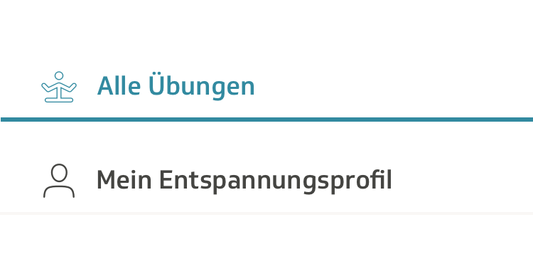
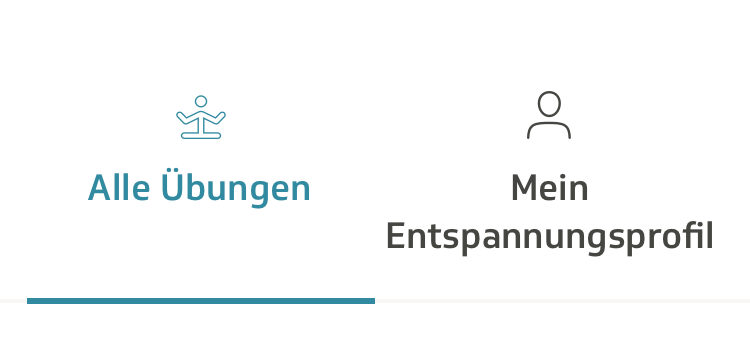
…before deciding on this. The name was changed from “stress management profile” to “relaxation profile,” because it was shorter and it sounded nicer. “Relaxation” is a more pleasant word to read than “stress.”
The content team updated and shortened some of the text in the final version. I was also given the feedback that the “number of times performed” attribute should look different from location, media and time, because it wasn’t an attribute of the exercise itself, but rather connected specifically to the user. I put each “performed” label in its own self-contained pill and gave it a teal-colored background to make it stand out.
Visual design for exercise page
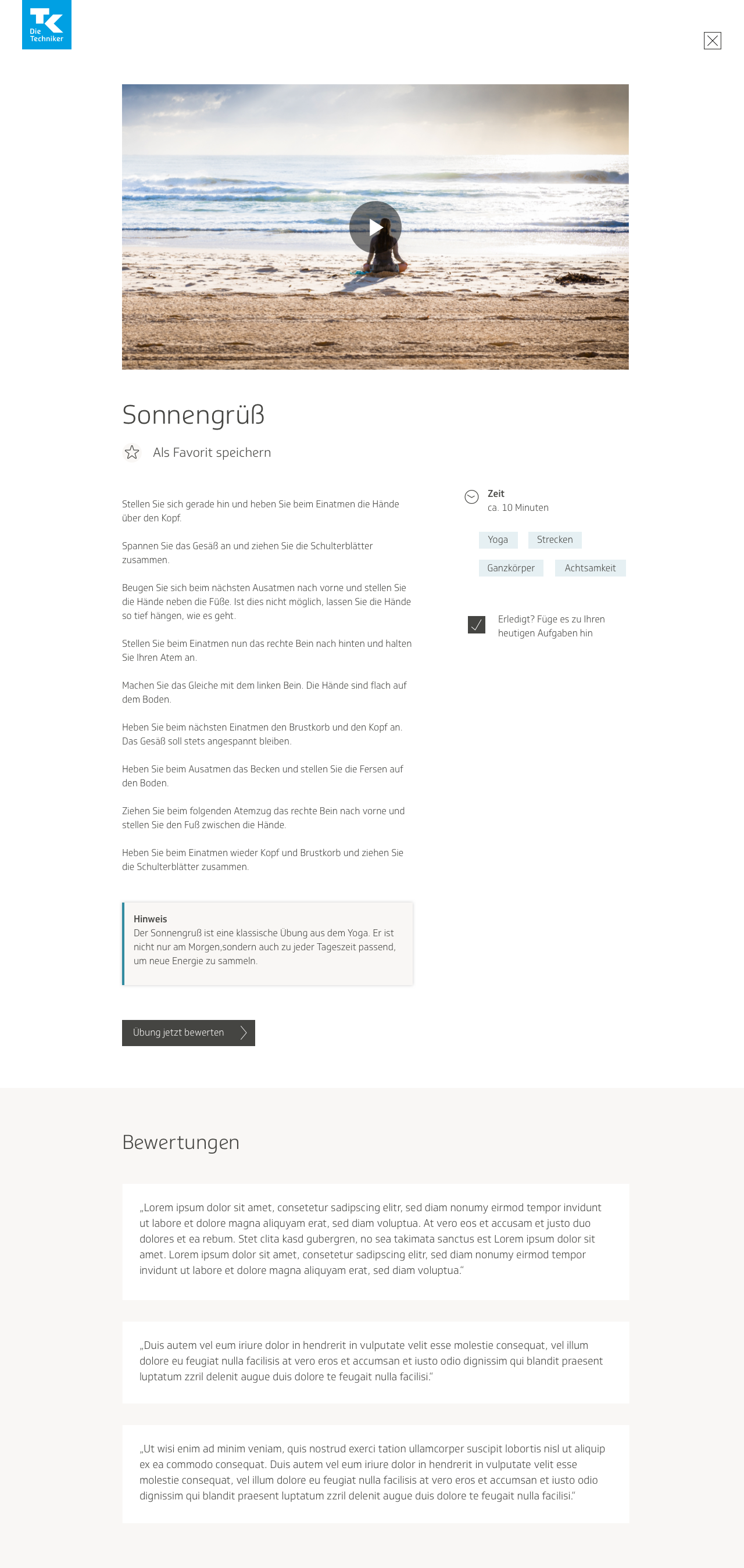
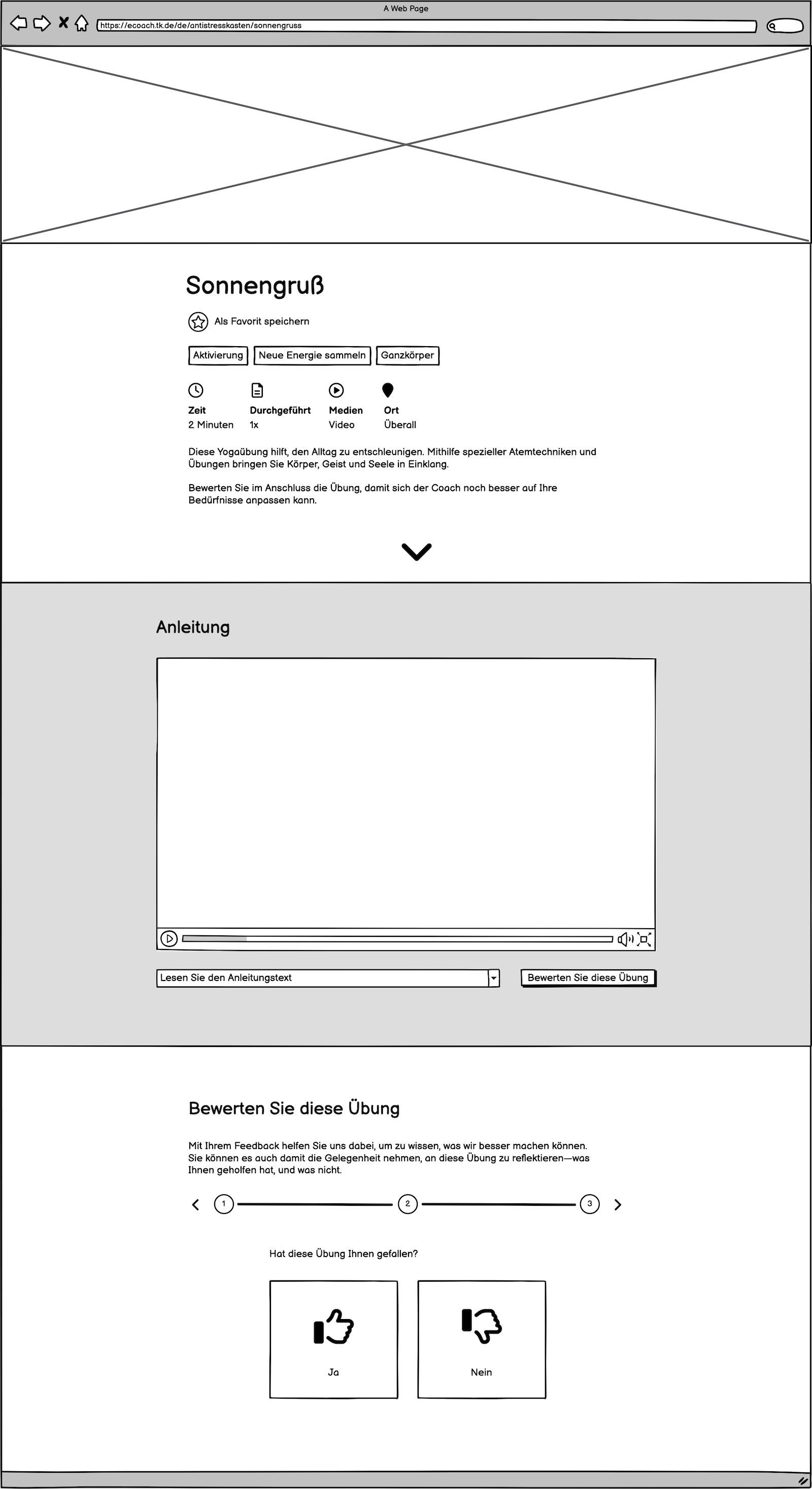
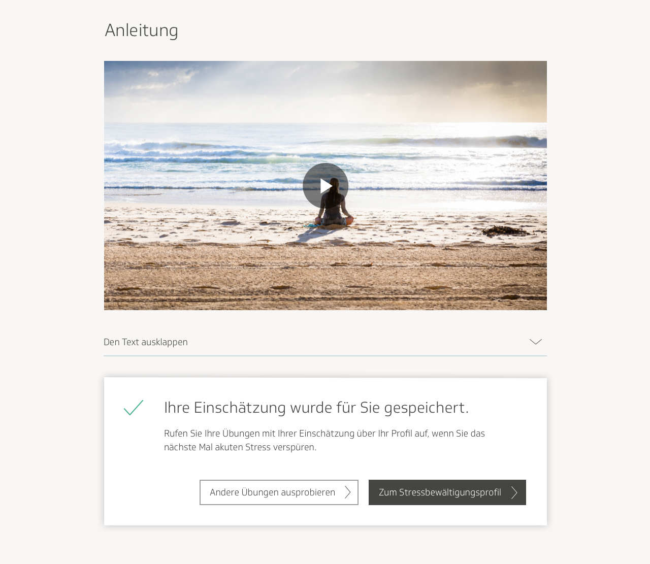
I took the newly updated wireframes for the individual exercise page and implemented them into visual designs, with all the aforementioned changes: header image, categories at the top of the page, introductory description, and collapsable text.
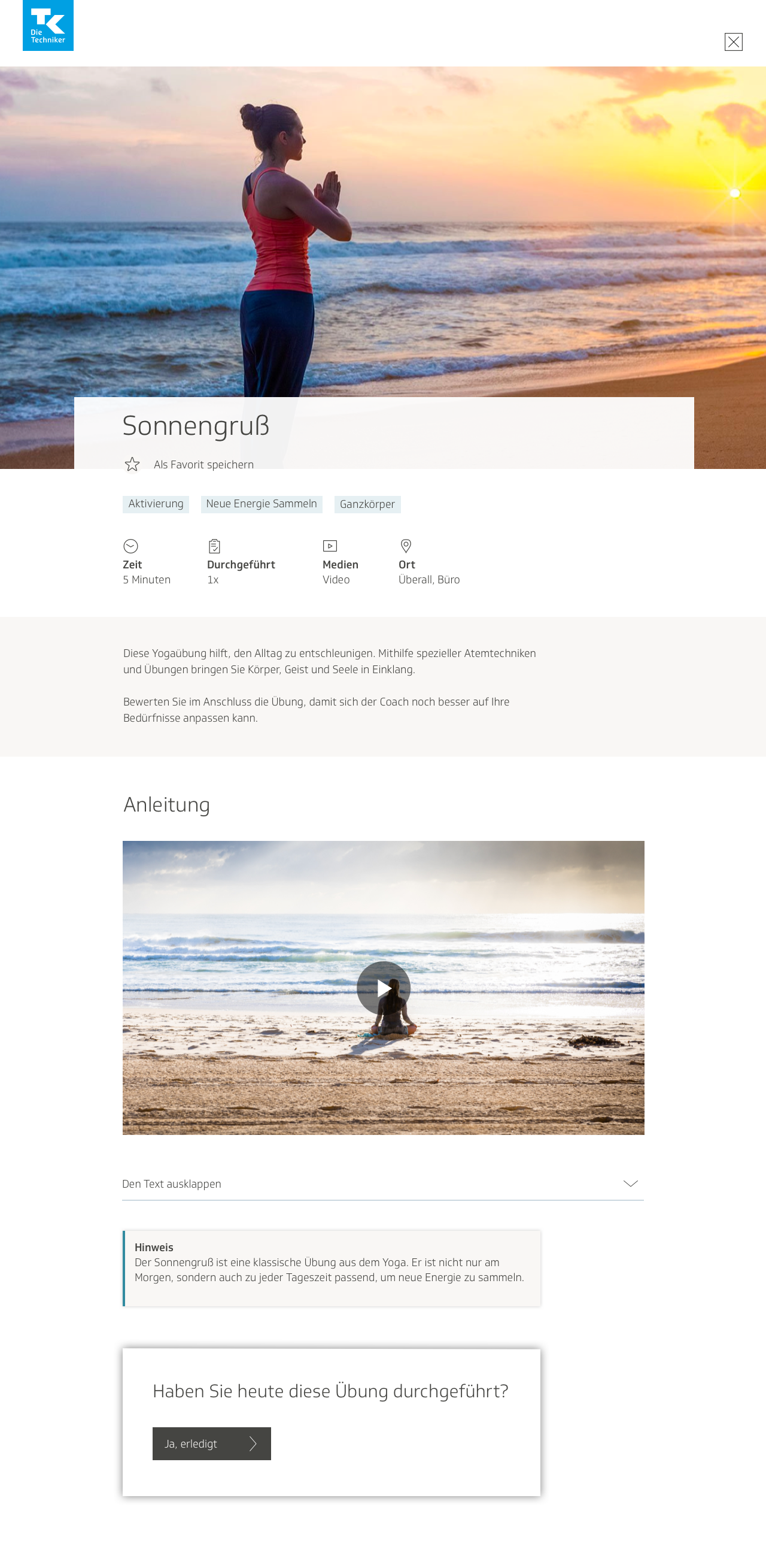
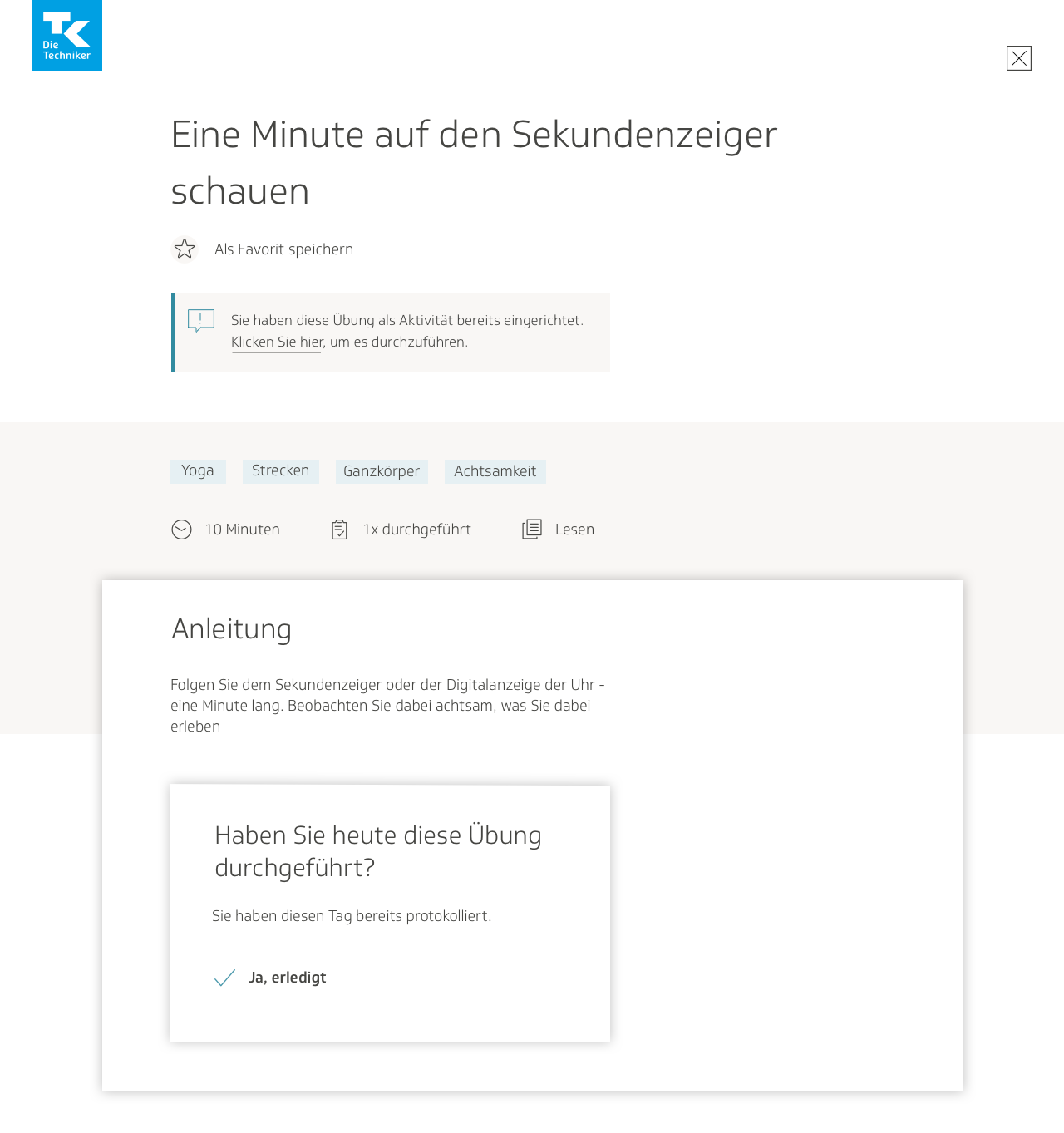
In a later iteration I removed the gray background from the introductory text to make it look more as though it belonged to the rest of the header, and added a clickable arrow that would scroll down automatically to the instructions. At the time I was also gutting the feature that allowed users to plan an exercise as an activity, and coming up with a design for the expanded rating section. In order to reflect these updates, I redesigned the section at the bottom of the page such that users had the option to mark the exercise as finished, and also open a modal window where they would be guided through a survey.
In the fourth iteration of designs, I experimented still further with the box on the bottom of the screen, giving it a heading and updating the text for clarity. I made it such that in order to mark the exercise as finished, the user would have to open the window.
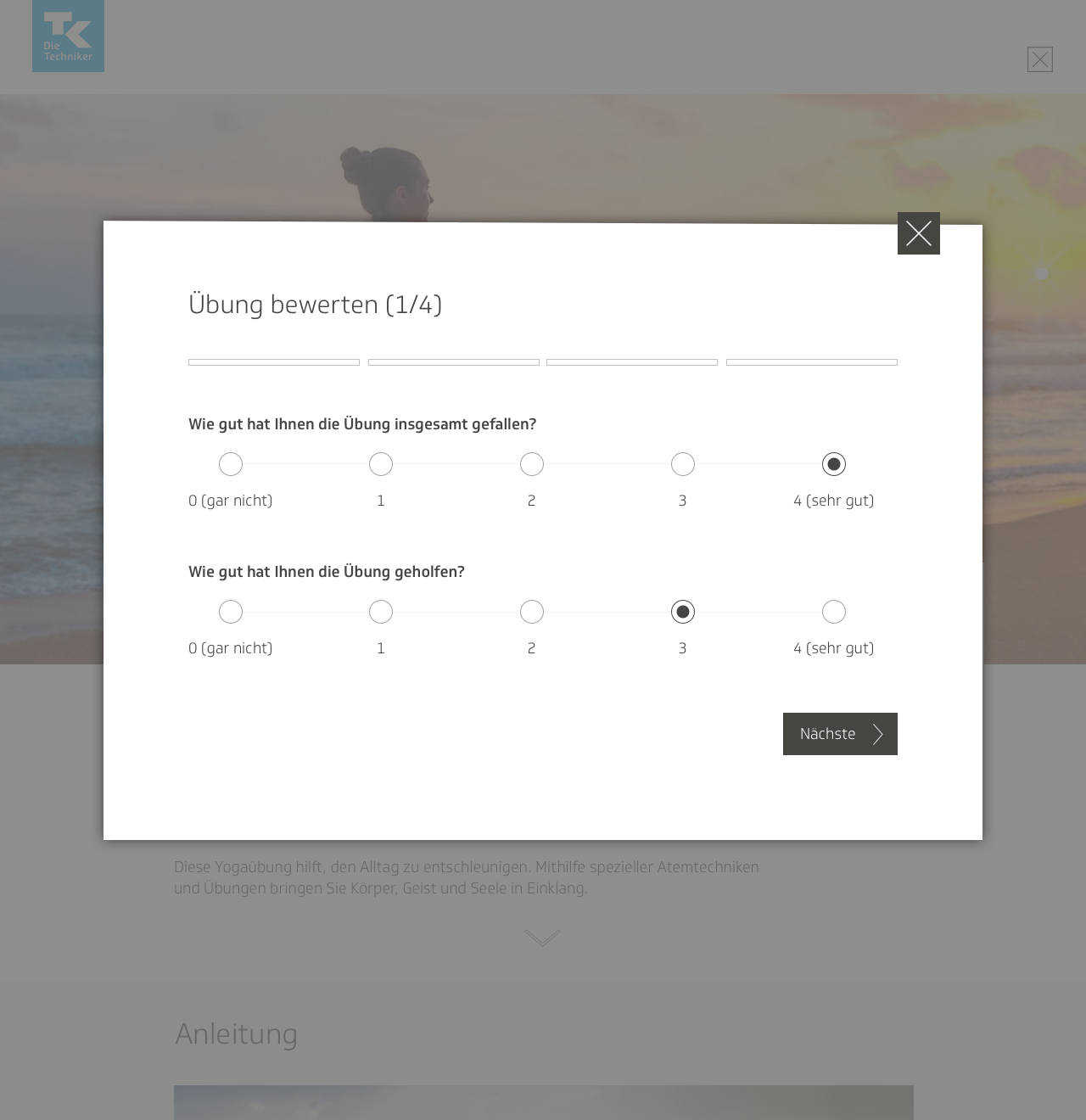
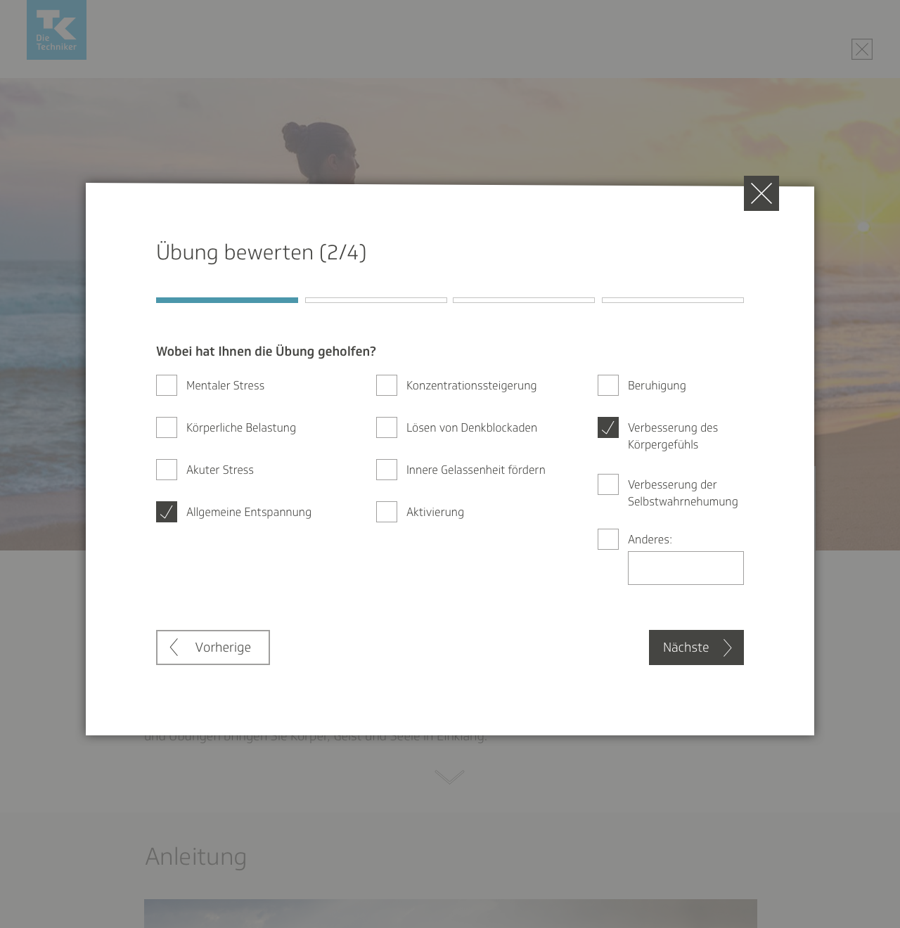
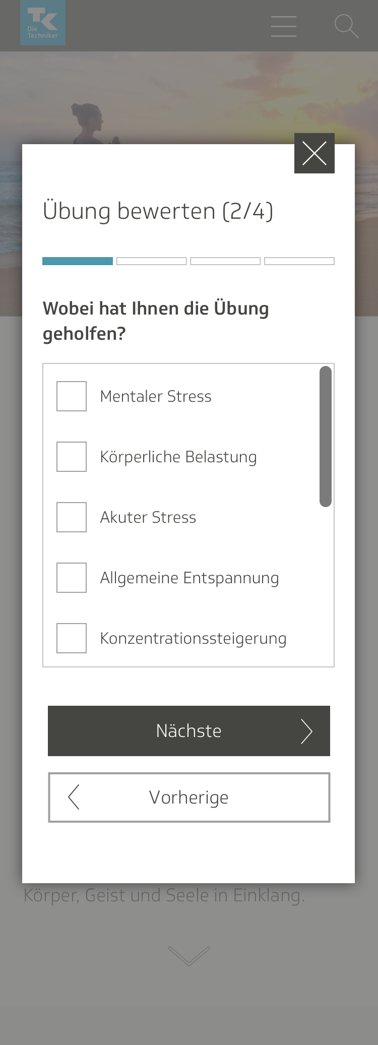
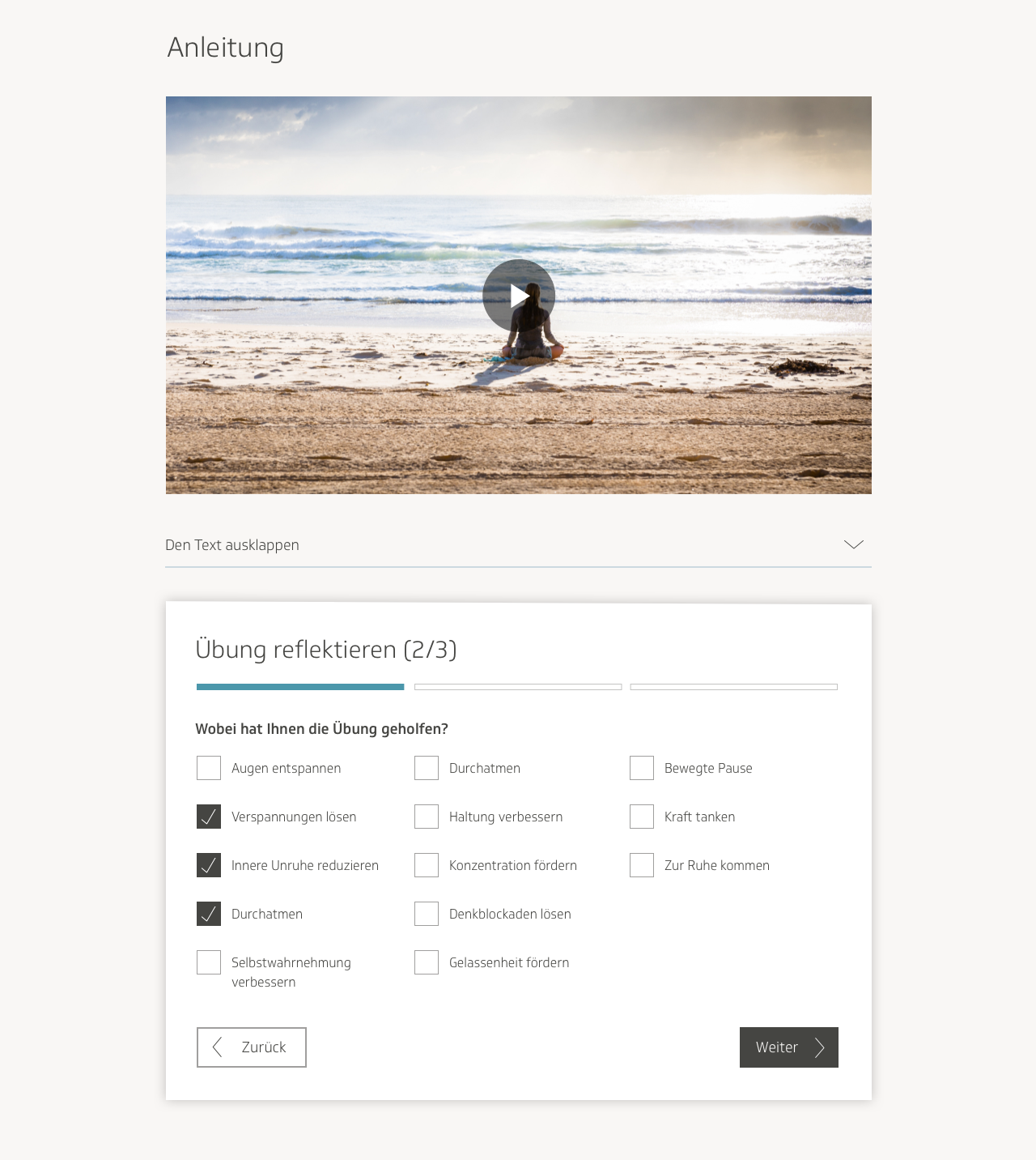
Upon opening the modal window, the users would be met with a wizard-style survey, with questions broken into different steps. They would fill out answers to questions about whether they had found the exercise helpful, which mental or physical area it had helped them out in the most, where they had conducted the exercise, and so on.
After submitting the filled-out questionnaire, the user would then have three options: view the results in their profile, return to the exercise page, or browse through other exercises on the main page.
I ran into a few interesting challenges while formatting the questionnaire for small screens. For instance, I wanted to keep the size of the modal window small, even with all the stacked content. I ended up putting some of the lists of checkboxes into scrollable windows.
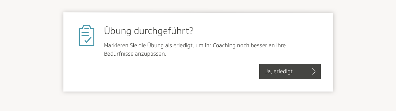
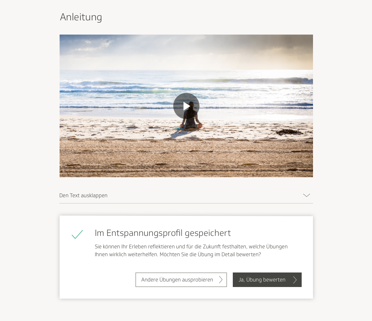
I didn’t think it made sense to have the user submit an entire questionnaire every single time they just wanted to mark the exercise as finished, so the team and I decided to separate the questionnaire just from marking it finished. We would greet the user at the end of the exercise with a simple prompt to rate the exercise on a scale of one to five, then ask them if they also felt like filling out a questionnaire.
The developers also pointed out that if the user were to mark the exercise as done, then refresh the page, the page would revert to the unmarked version, thus potentially causing confusion for the user. They recommended we add an indication of how many times overall the exercise was performed.
I experimented with a flurry of different versions for how this could look.
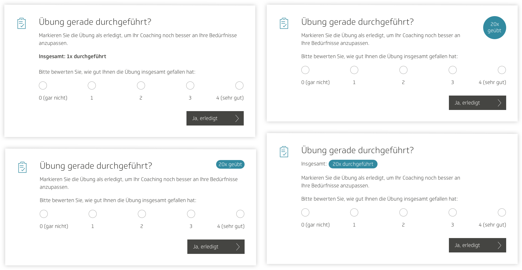
In the final design iteration, I got rid of the marker at the bottom of the page for how many times the exercise had been performed. Since we already had one at the top of the page, I thought it was redundant. We also added a little information symbol in the box at the bottom of the page, where users could hover and read a small tooltip description of what the feature was.
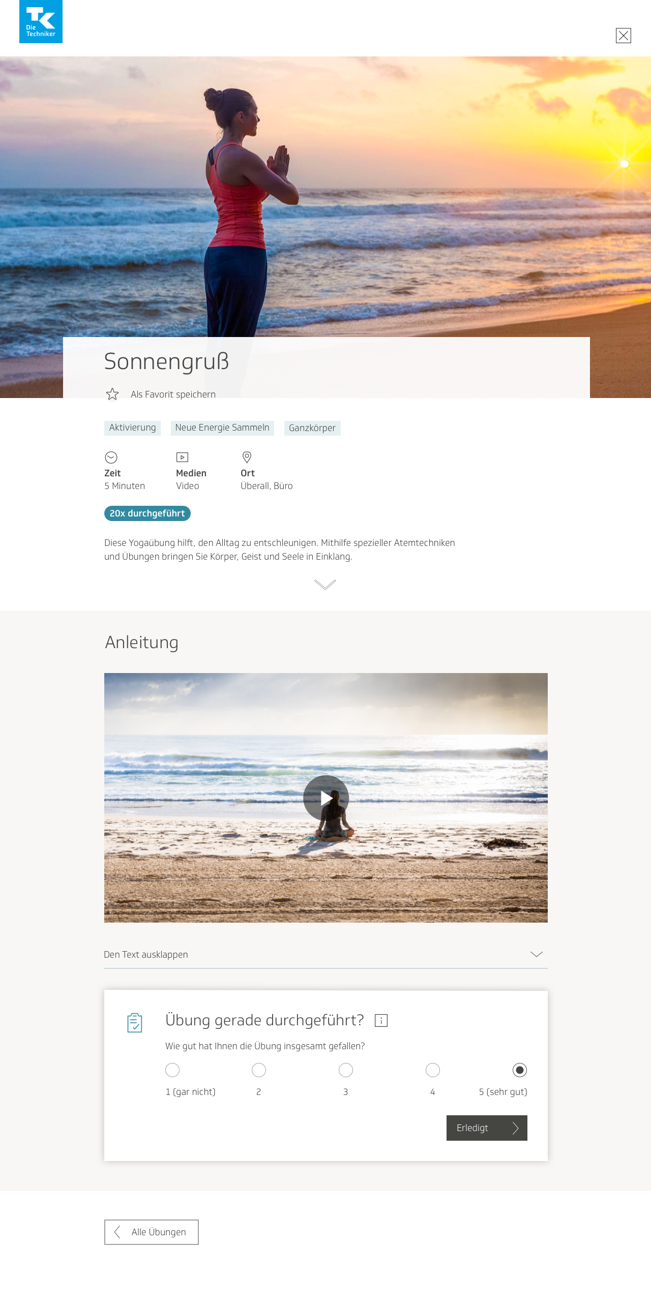
Here is the final iteration for the audio media page:
And the text media page:
After rating the exercise on a scale of one to five and marking it finished, the user would receive a confirmation that it was now visible in their history on their profile. They would then be asked whether they wished to continue with an additional questionnaire, or browse through other exercises instead.
I was informed by our developers that the modal box design for the user survey would not work, because since we were following the same format as the cookbook, the individual exercise page would already be its own modal window. I was not aware of that, because it didn’t look like a traditional modal window. I edited the design such that the survey dialog box would be right there on the page, and not in a separate window.
After submitting their response, the user would then be given the option either to visit their profile and view the results there, or to return to the main page and browse the exercises there.
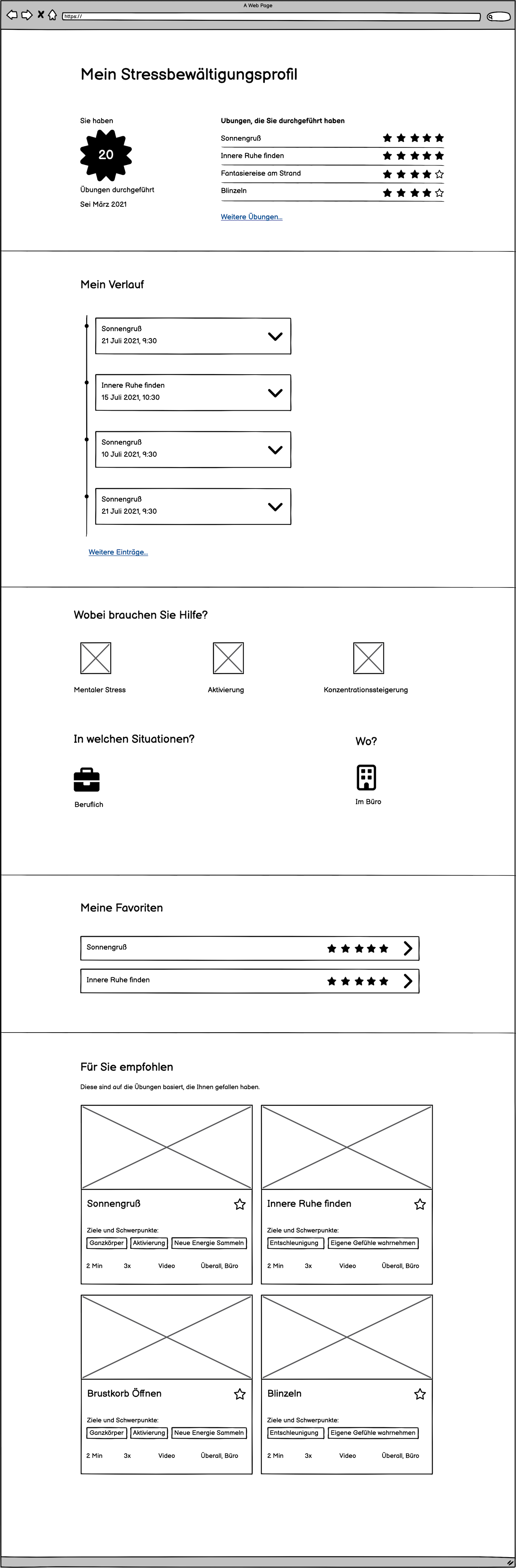
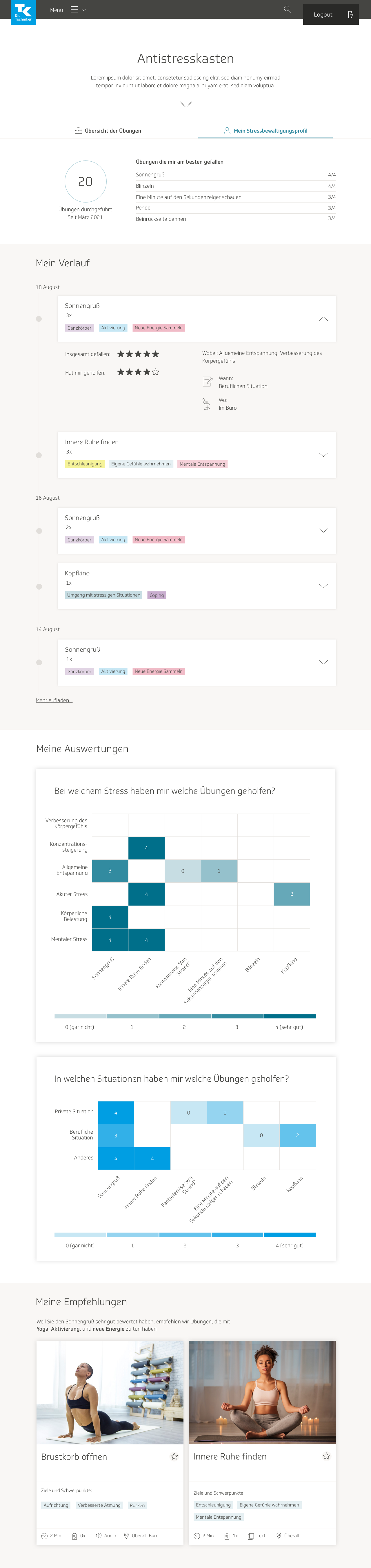
Refining the user profile
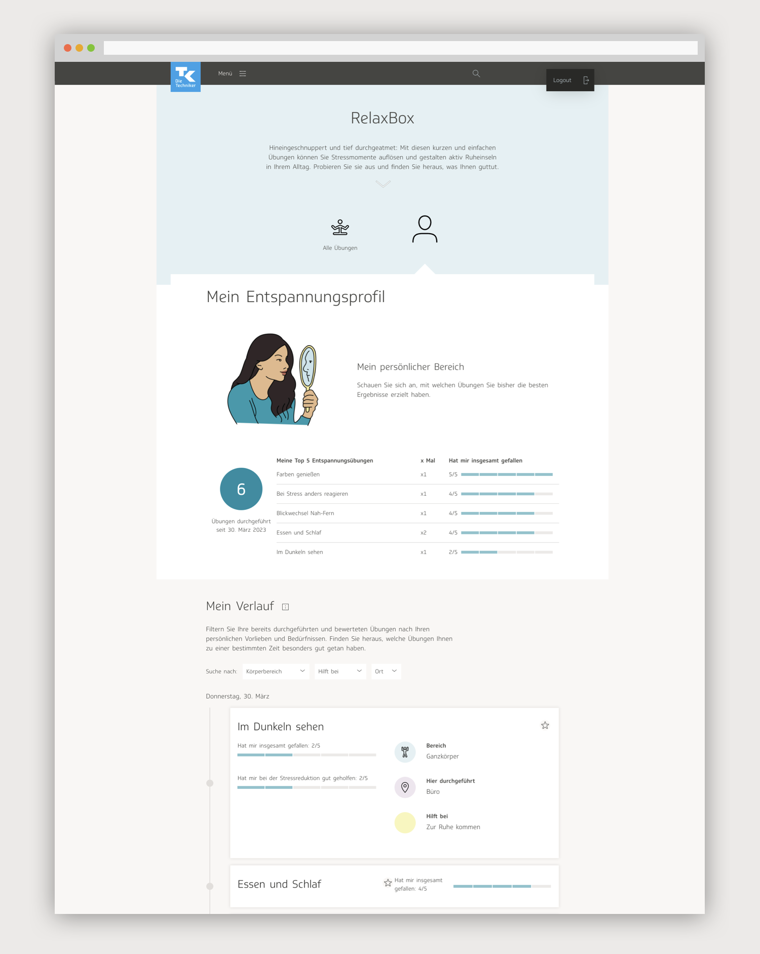
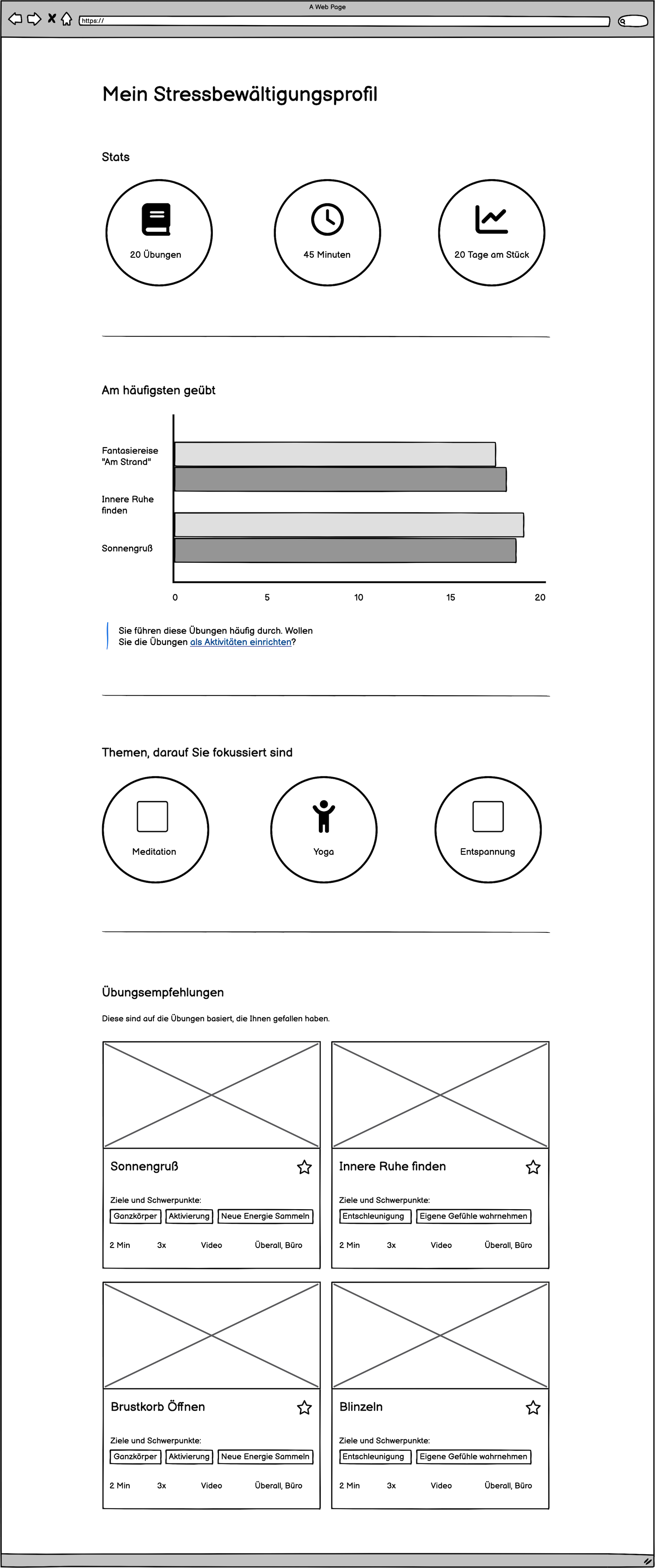
I took the wireframe I had created for the user profile and implemented it into a visual design. As in the wireframe, the earliest version started off with stats at the top: number of exercises performed, amount of time spent on them, and how long of a streak the user is on. It then shows a graph with most frequently used exercises, a section with areas of focus, and a list of recommended exercises based on what the user has already done.
At this point, the feature was still very much in the brainstorming phase. I felt some user feedback was necessary before moving forward, so we conducted an internal user test to collect feedback on the profile. We had users interact with the screen and observed their behavior. We asked users if they used any apps that had a profile with similar content, such as a fitness or mindfulness app, and if so, which features it had and what they liked about it. We asked them what expectations they had from a user profile section, and what they would like to see, or what sort of content they would find helpful here.
Users were interested in seeing a record of exercises they had already performed, when they had performed them, and how it helped them manage their stress levels, in which specific areas of their lives. Some said it would motivate them to keep going if they could track their progress in stress management and feel a sense of improvement. The users liked the concept of the stats area overall, though there was some confusion about what some of the numbers meant. They also wanted to see more specific information about each exercise they had done, not only an overview. They weren’t as interested in the focus points widget, and in some cases didn’t understand it at all.
I addressed this in the second iteration of the screen by adding a timeline of every exercise the user had done, sourcing data from the questionnaires submitted for each exercise. I went back to the drawing board, putting together a second wireframe before starting on any more visual design. I also added a favorites widget, because some users had said this would also be of interest to them.
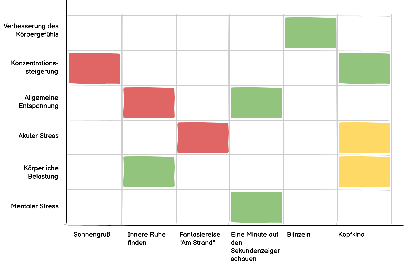
Since users were so interested in gaining a more nuanced sense of the relationship between their stress levels, the types of stress they were experiencing, and the exercises they were performing, the content editors and I also thought it could be a good idea to have a graph to illustrate it. We decided to create an evaluation graph where users could see the exercises they performed, the physical or mental areas where they had helped, and how helpful they had been.
In one early draft, I put the exercises on the X axis, the physical and mental areas on the Y axis, and used green, yellow and red to distinguish how helpful the exercises had been, where green was very helpful, yellow was moderately helpful, and red was not helpful at all. In general, I try to avoid having color be the only cue to indicate success to a user, because some users are color blind and colors can also carry varying connotations to users from different cultures. This was purely brainstorming and thinking ideas through.
I played around a bit more with the placement of various features on the stress management profile, contemplating its look and feel.
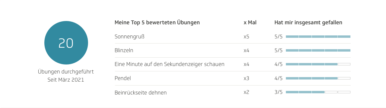
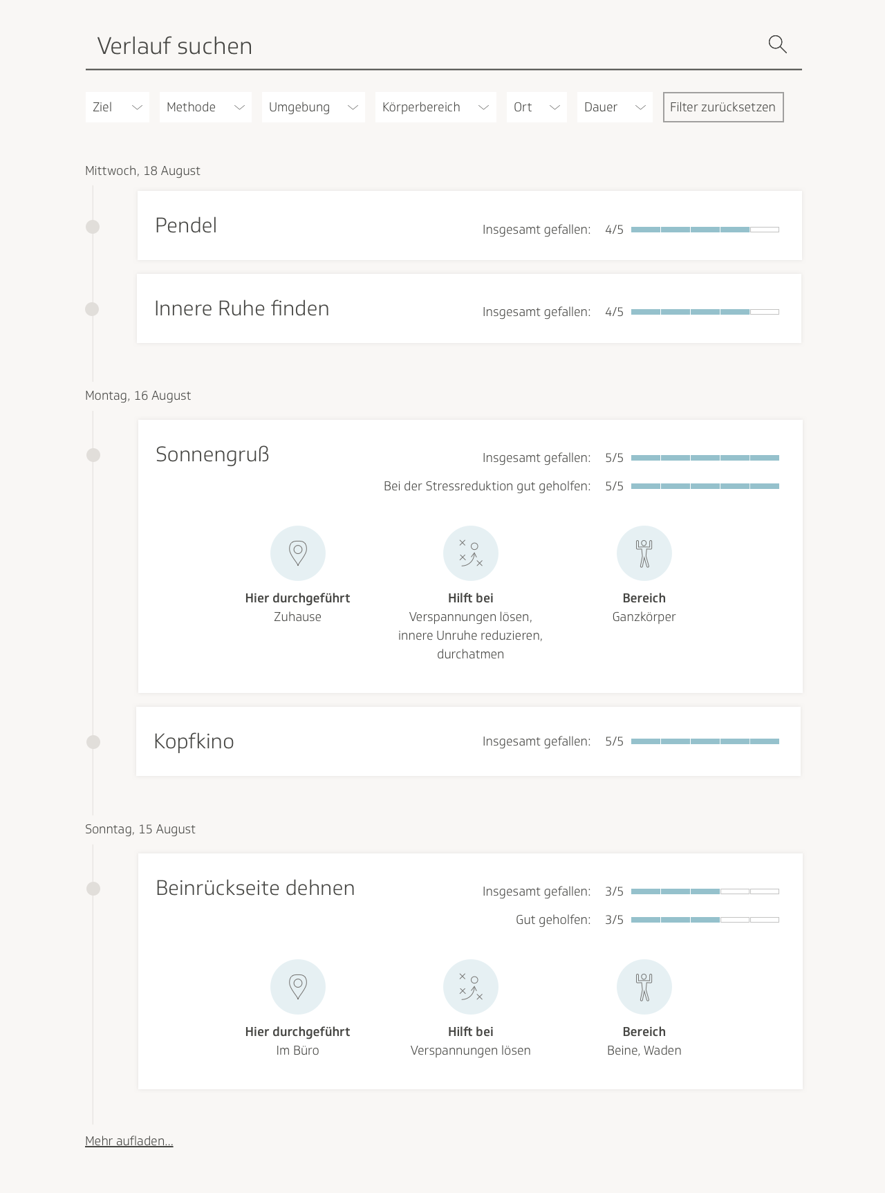
The visual design I produced contained an updated version of the stats, where I tried to provide more clarity. It showed the amount of exercises done, as well as the exercises that the user had given the highest rating, and what rating they received. It also included a timeline of completed exercises. Each exercise on the timeline would contain the respective categories to which it belonged, as well as how much the user had liked it, how much it had helped the user, in which areas the user had found it helpful, in which type of situation the user had utilized it, and where the user had conducted it.
Underneath the timeline, I included evaluation graphs. On the X axis, they showed the user’s most frequently practiced exercises. In the first graph, the Y axis displayed which types of tension and stress the user had attempted to address using that exercise, and in the second graph, it showed in which type of environment the user had carried out the exercise. The different hues represented the number the user had given in the rating, from 0 to 5.
I did not include the favorites section here, because this was already a filter on the overview page that one could use to sort out exercises.
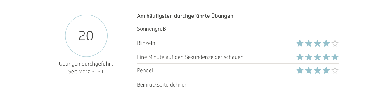
The stats section gradually underwent several evolutions. I thought just showing the rating in numbers didn’t convey the message as instantaneously as using visuals, so I tried using stars.
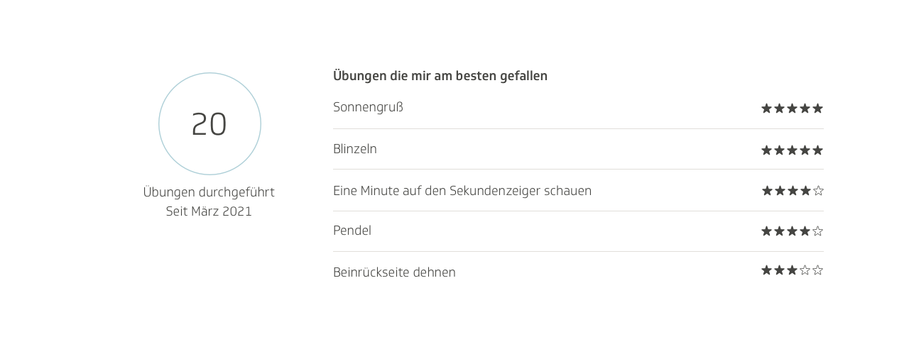
The stars looked a bit strong, so I tried out softer colors. I also switched it from “most liked exercises” to “most frequently practiced exercises.”
I also worked on the timeline. I moved away from the accordion format, giving each exercise on the timeline its own designated box, with all the relevant information inside it. To add more visual stimulation, I added icons for the different categories of where the exercise was conducted and in which type of situation it had been helpful.
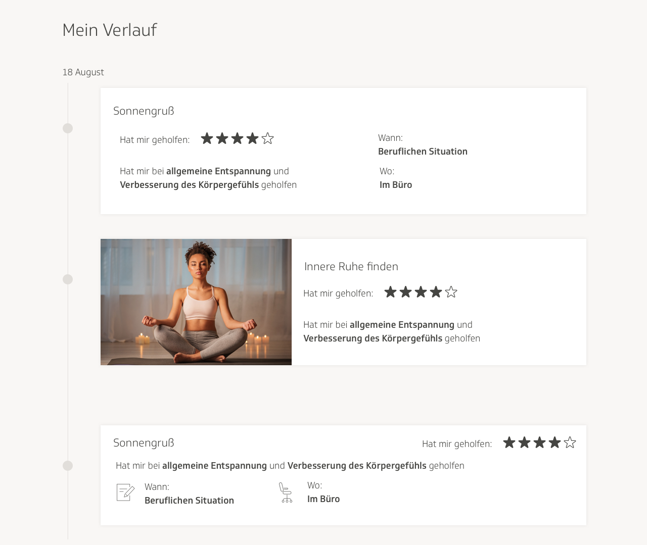
All these designs, however, were still very much in a rough and experimental state. It was by the fifth iteration or so that it began to feel as though it was coming together. In this one, I no longer used stars to show the rating the user had provided for each exercise. I disliked the use of stars because it felt too visually loud and it also felt too akin to a movie review website. I replaced the rows of stars with little bars, and kept one star next to them as an icon to symbolize what the user was looking at.
I added a search bar to the timeline, as well as filter categories, similar to what was on the main page. I made the icons and categories more neat and organized. I also considered the use case where a user only submits a rating to mark an exercise as done, and doesn’t fill out the rest of the questionnaire. In that case, there would simply be a small indicator of whether the user had liked the exercise or not. Here there is an example on the bottom of the timeline, with “Gefallen” written in green, which means “liked” in German.
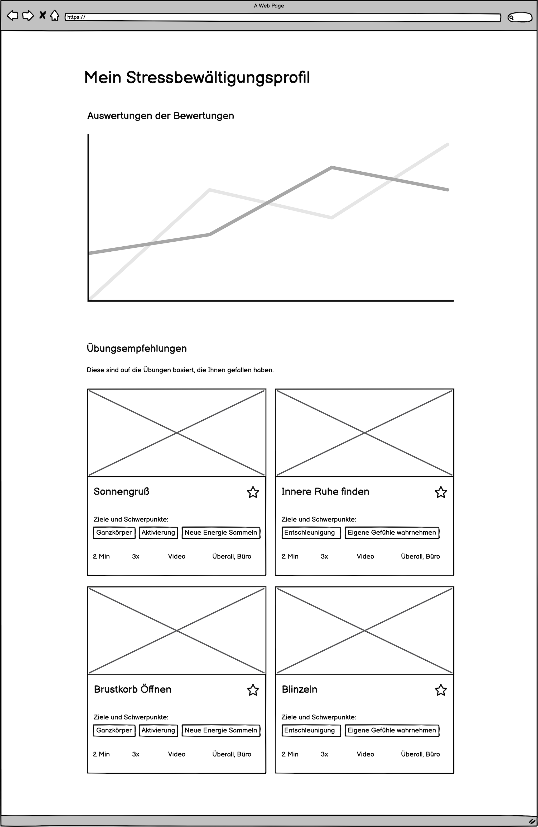
I also got rid of the evaluation graphs. I received feedback that they were too challenging to understand, and with the timeline already presenting a lot of the same information, the content team and I felt they had become superfluous. We didn’t want to overload the users with features, especially if the information contained in them was redundant. We also did away with the recommendations section. The resulting screen design was much more concise:
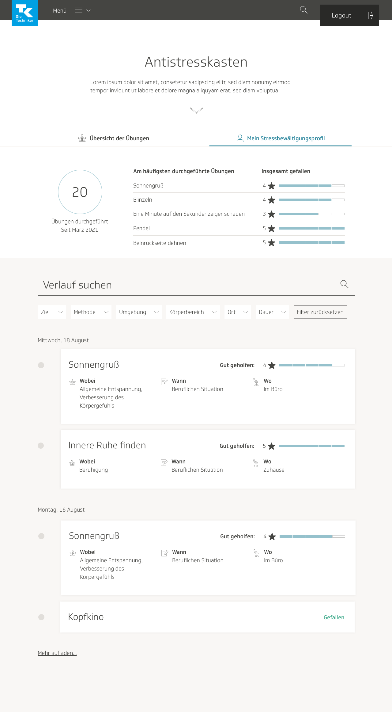
We conducted another internal user test. Some feedback we received was that it was unclear what the 20 in the stats section stood for. I’d based the circle on a component from our design system that was used for scores and evaluations, so users weren’t sure if that was what it meant. Users also couldn’t tell whether the numbers in the top most frequently practiced exercises stood for how often the exercises had been performed, or whether they had been marked four times as “liked.” They also thought that using numbers, stars, and strips to show a rating was unnecessary, and that the design could be simplified.
I filled the circle to differentiate it from the ones we used in our UI library for scores. For clarity, I separated the list of most frequently used exercises into three columns: title of exercise, how many times it was practiced, and the rating given by the user. I ranked them in order of rating, and got rid of the stars entirely.
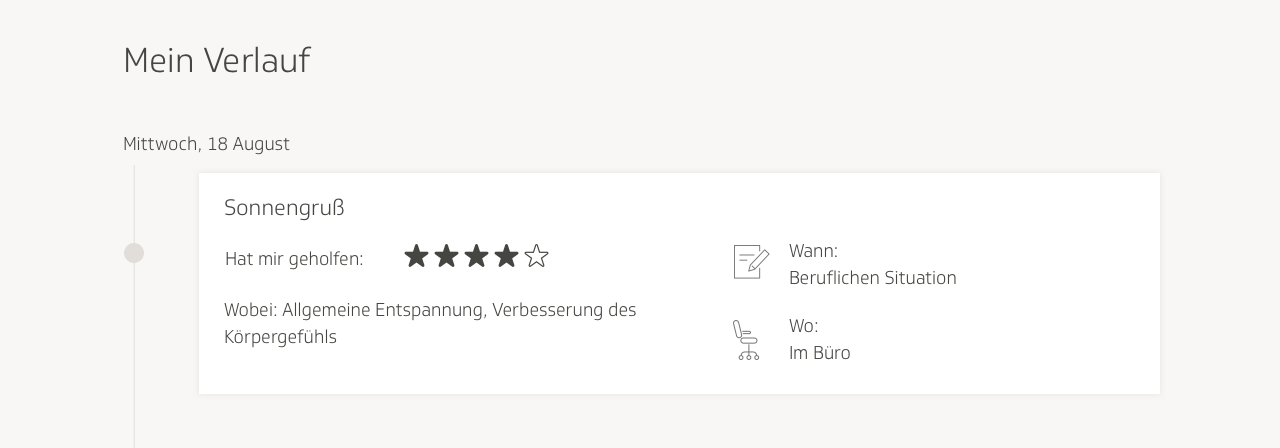
In the timeline, one user thought it was confusing that we labeled the type of situation in which to use the exercise as “when.” He said it should be more descriptive. For example, “which type of professional situation,” would have been less vague. Users also found the “Gefallen” confusing, especially because it did not conform to the visual precedent that had been set by the blocks with the data that had been filled out from the questionnaire.
I updated the timeline to reflect those concerns. Each box now contained a rating for two categories: “liked overall” and “helped with stress reduction.” I made the other categories more specific: location where exercise was performed, type of stress that exercise helped with, and area of the body where the exercise helped relieve tension. I made the corresponding icons bigger, and placed them within colored circles, to grab the user visually.
I eventually gave the areas different colors for more differentiability.
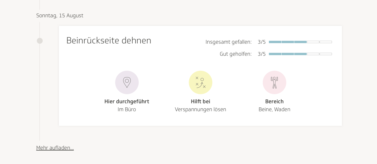
In the final visual design, I separated the categories and ratings into two separate columns in each box, for a more organized look and feel. I also got rid of the search bar, and left only the filters, because none of the content in the boxes had been submitted via free text, it was only a series of categories, which only required filters for searching.
TK also thought the header of the page could use a visually stimulating introduction, with a blurb on what the page was, and an image. TK occasionally would ask one of our designers to create illustrations in a specific style, and use them for various features throughout the eCoach. I offered to contribute an illustration in a similar style for the profile page. I drew a person examining herself in the mirror, to imply self-reflection.
Conclusion
My designs were handed off to a team of developers, and after I conducted a design review of the product, it was launched. We hosted more user testing sessions and made further optimizations down the road. For instance, we decided to do away with my tab design, in favor of the one that was used across the activities page, for consistency with the rest of the site.
This was the largest-scale design project I had ever worked on at that point, I was the sole designer for the majority of it, and as such, I learned a lot from the entire process. I gained more experience in user testing and information design. I solidified my design process more; there are some steps I took during this project that I would not repeat, such as starting on visual designs before having finalized wireframes and user flows. I realized it’s also a good idea to annotate large design projects; as I was writing this project up, looking back on nine months’ worth of design drafts and user test results, it was difficult to remember exactly everything I had done and why I’d done it!
What felt compelling for me about this project was getting to build a product meant to improve users’ emotional well-being. The tech industry has exploded since my first web design internship in 2012. It is ubiquitous, bleeding its way into more and more aspects of our lives. As a tech professional, I recognize the power that I have to affect human experiences on a grandiose scale, and I always to use my skills towards supporting humanity. As a person who has suffered with anxiety, I know how insidious it is. As such, the connection I felt to this project was a personal one. If I can help even only one of 20,000 eCoach users improve their mental health, that inspires me to keep going with my work.


